Income Per Person vs. Primary School Completion
Income Per Person and Primary School Completion among Countries around the World
In America, education is a right that everyone is given. This is not what it is like around the world. Children around the world are not getting their birthright of a proper primary education. It has become depressing that some children are not being able to complete their primary education because of financial need. All around the world, there is a positive correlation that shows when the income per person is higher in a country the country has a higher percent of children completing primary school. Education is a human right that everybody should receive easily. Countries with lower average income per person have lower primary school completion rates because the countries are not funding the schools and parents cannot afford the fees.
The first thing that we must look at is what causes students to drop out. Students around the world drop out for many reasons, including having to work and help out with their family, they might be very ill, or most commonly their family cannot afford schooling. Taken from the United Nations Educational, Scientific, and Cultural Organization report of Education For All Global Monitoring Report, there is a paper titled School Drop out: Patterns, Causes, Changes, and Policies, “There are many factors associated with dropout, some of which belong to the individual, such as poor health or malnutrition and motivation. Others emerge from children’s household situations such as child labour and poverty.” This quote means that sometimes children drop out of school because they have to work to afford to live and get their family out of poverty or it could also be because they are too sick to continue going to school. In this graph from gapminder who collects data from various sources, we can see that there is a problem particularly in Africa, which are the blue dots. This data is collected from the World Bank and other various sources.
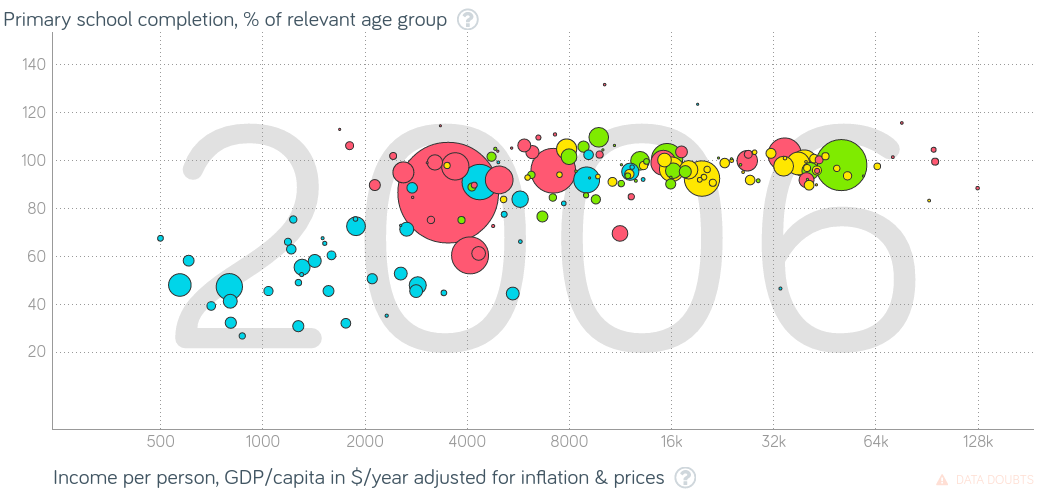
This graph shows income per person, GDP per country and Primary School Completion for the same country. Income Per Person is the explanatory variable in this instance and primary school education is the response variable. This is because primary school completion is dependent on income per person. The size of the bubble represents the population of the country. Green represents the Americas, Red represents Asia and Australia, Blue is Africa, Yellow is Europe. This graph shows a small correlation between the income per person and the primary school completion, but it is evident what is happening all around the world. You can see the trend, where countries that have less income per person means there is less primary school education. Overall, there is a pattern but if you look at the trend within specific countries there is not a trend. This can be backed up with my reasoning that students drop out of school to work and make money for their family.
All around the world, there are barriers to education. The biggest barriers would be a lack of funding of education, not having a classroom and/or lack of learning materials, hunger, and the expense of education (formal and informal fees). From the Global Citizen, an article titled 10 barriers to education around the world there is a quote, “In many countries in Africa, while education is theoretically free, in practice ‘informal fees’ see parents forced to pay for ‘compulsory items’ like uniforms, books, pens, extra lessons, exam fees or funds to support the school buildings.” This quote is specifically mentioning Africa and the fact that education is free but there are hidden costs that hit the family hard. These fees are necessary and commonly send families into a cycle among generations of poverty because of them. This happens because if a family is spending an overwhelming amount of money in hidden fees for school they will not be able to crawl out of poverty. This means that their children are going to have to live in poverty and then have children and having to pay their hidden school fees. There is just an overall lack of money going towards a proper education for the children in these countries.
As we follow few countries on the graph we begin to see how each individual country follows the standard of more money more school completion.
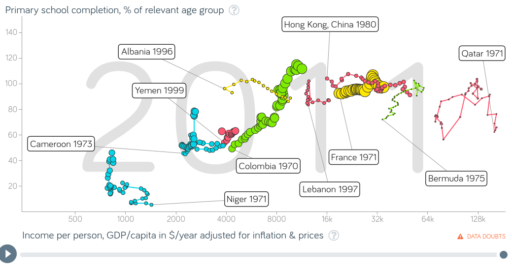
For example, Bermuda, the green trail (which means that it is in the Americas) to the right of the graph. You can see the as the income per person rises so does the primary school completion, as well as Columbia. While there are some countries that do not follow this trend and this is because of other things happening within the country, like war. In Qatar, if you follow the trend you see that as income per person goes down primary school completion goes down as well.
Financing education is very different to for some families around the world. While education is free in many countries around the world, families still cannot afford to send their children because they live in extreme poverty. From an article published by Our World In Data titled Financing Education, there is a quote “The second half of the 20th century marked the beginning of education expansion as a global phenomenon. Available data shows that by 1990 government spending on education as a share of national income in many developing countries was already close to the average observed in developed countries.” This quote means that during the 20th-century education became expanded to underdeveloped countries, like those in Africa. These underdeveloped countries education systems are now similar to developed countries. Although, there are still children unable to complete their education.
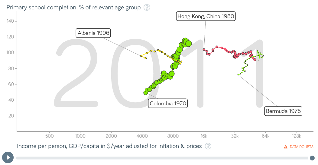
To answer my research question, How does income per person affect primary school completion in countries around the world? I graphed income per person as the explanatory variable, and primary completion as the response variable. The explanatory variable is on the x-axis which is on a logarithmic scale and the response variable on the y-axis which is on a linear scale. The data shown in my graph was collected by the World Bank and put together by Gapminder. The size of the bubbles represents the population of each country. Looking at each country separately you could say that some have positive correlations while others have no correlations, there are sharp increases and decreases in each of the countries. When you look at my graph you can see that there really is no pattern as to where they start, they all start at the amount that a person is making per year. You can see that Albania and Hong Kong, China follow the same kind of pattern which is no correlation between the two variables. You can also see that Columbia and Bermuda follow the same kind of pattern which is a positive correlation between the two variables. A positive correlation on this graph would mean that when the income per person rises, the primary school completion rises with it. You can conclude that countries that make more money have more students finish primary school.
In conclusion, It is more likely for a child who lives in poverty to not complete primary school compared to a child that does not. This is because of the overall lack of money that parents can afford for formal and informal fees, the fact that some children have to quit school and work to provide for their family, or that some schools do not have enough funding to create a good enough learning environment. This is important to learn about and do more research because there are a lot of things we can do to help the children in need of their human right to a proper education. We can donate money, or even travel to these places to help the children learn and grow. We can see that governments in countries all around the world are starting to give more money to education but it is still not enough for some people.
Works Cited
"10 barriers to education around the world." Global Citizen. Write To Learn, 2 June 2014. Web. 10
Jan. 2017.
Roser, Max, and Esteban Ortiz-Ospina. "Financing Education." Our World In Data. N.p., n.d. Web.
10 Jan. 2017.
School Drop out: Patterns, Causes, Changes and Policies . Tech. N.p.: United Nations Educational,
Scientific, and Cultural Organization, 2011. Print.
Shah Follow, Jamal. "Causes and effects of dropouts at primary level." Share and Discover
Knowledge on LinkedIn SlideShare. N.p., 13 Feb. 2014. Web. 10 Jan. 2017.
Comments
No comments have been posted yet.
Log in to post a comment.