Q4 Art Project - The King In Yellow Falls To Feline
King in Yellow, more like King in black and white stripes amiright?!
Let’s start with some compare and contrast…
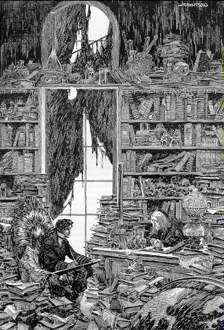
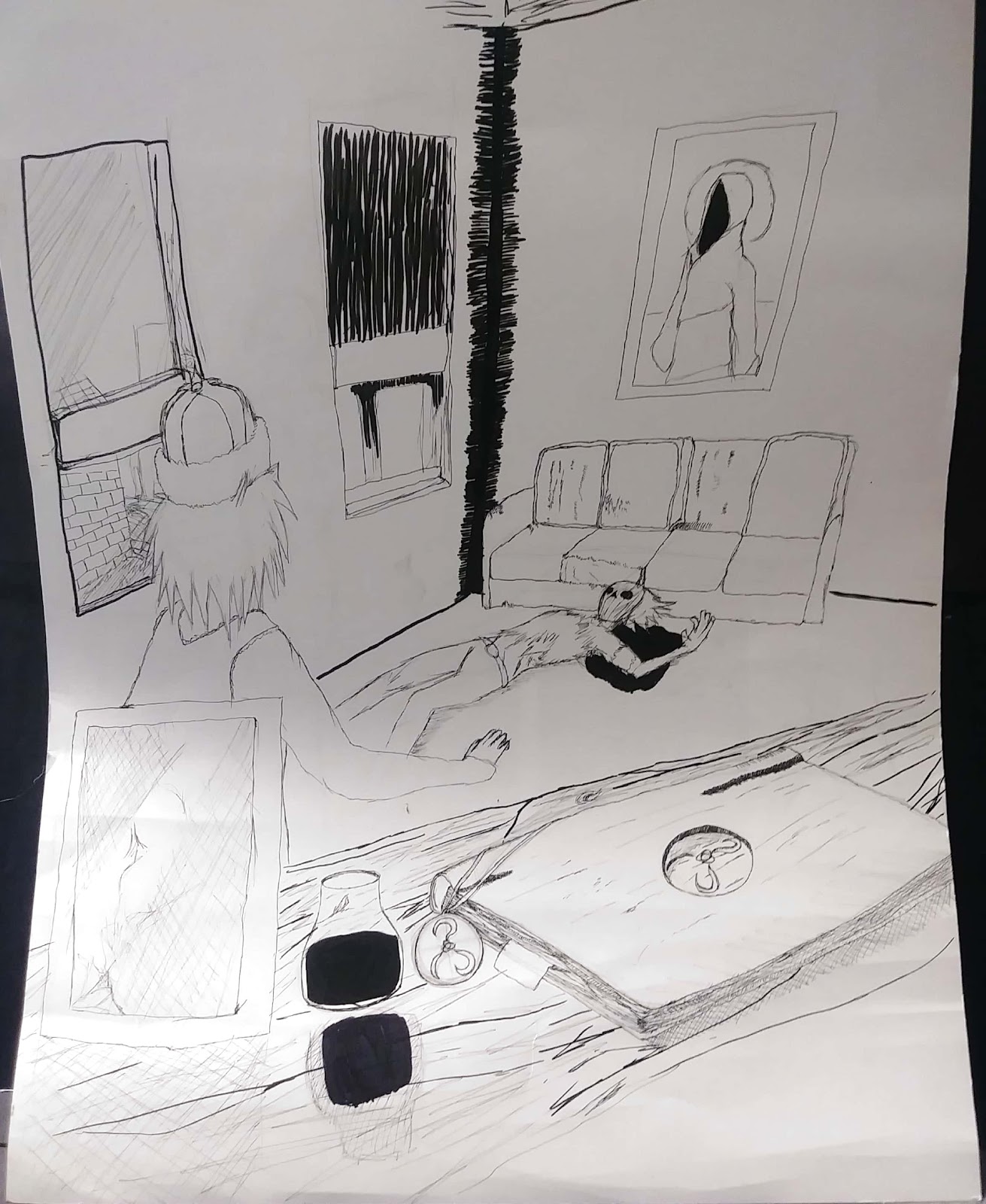
On the left is an amazing image done by Silver age Comic Artist Bernie Wrightson, an amazing piece of work done for the Frankenstein comic adaptation. Witness the detail and care put into each and every piece of clutter, see the intense planning to create a cohesive yet chaotic image. On the left is Baby’s First Cross-Hatching Tutorial (my artwork, sadly), a piece much more lacking in the planning and clutter department. The table in the foreground somewhat captures what it wanted to emulate, but not in it’s entirety.
The piece of art I created is a black and white image focused on two men standing within a room together, one on the floor bleeding and the other stunned to witness the sight. Littered among the foreground is a tome bearing the Yellow Sign, along with a pendant bearing the same sigil. Along with a framed image of an unknown woman with unknown importance. On the back wall, A hanging portrait of the King in Yellow. I wanted to truly capture the feel of a Wrightson panel. The moody darkness, and the intricate cross hatching of his panels. Unfortunately I got nowhere near that, but what can you do? I went at this trainwreck with an extra-small Faber Castel pen and a Faber Castel brush pen, along with my trusty Lead Holder (with 3h lead I got for an amazingly low price) and my extremely smaller .5mm lead pencil. I started out with a basic sketch of the scene, and I ended up having a much more solid idea of the background and foreground than the mid ground where the characters would be, and that came back to haunt me later on. I went about touching up the sketch, adding in details and redrawing the dead man’s face about 20 times before settling on a mask (slightly inspired by The Mask). After that I jumped straight into inking, starting with the foreground because that’d take the most work, golly gee, book pages and wood textures are really time consuming. After that I laid out the beginnings of the background and went about slaving over the foreground. Halfway through that I swapped back to the background and finished that, then finally, finished the foreground. There’s essentially only one technique used throughout the entire image and that’s cross-hatching, where you layer lines on top of each other to achieve a dark look, it’s not very impressive within my piece, but if you look to one of Bernie Wrightsons works you’d see it in action, depth, mood and entire silhouettes are established via cross-hatching, and the masters do it well. If there’s anything to be proud of in this work it’s the foreground, the wood texture, while a true pain to accomplish. It came out better than I’d ever hoped, and the book on said table came out spectacularly and is honestly the real star of the piece. In conclusion, I didn’t learn much, maybe something about how you spend your energy on things, or something about perspective, I’m not sure, but all in all, bless you if you enjoy the look of this dumpster-fire, and I’ll try not to make something so bad next time around.
Comments
No comments have been posted yet.
Log in to post a comment.