Brian Bess Public Feed
Q3 Benchmark How sleep affects the brain
Sports Physiology mini-project: Cheerleading
Environmental Science Benchmark
Volcano eruptions mini project
Biochem Q4 Fast Plants
Q4 Art Project
For my project I chose to study Akira Toriyama, the creator of the dragon ball series. By studying Toriyama, I had to create an art piece that either was an attempt at doing his own artwork just like him or making my own art but in his style, I chose the latter. I drew two African American warriors, powering up I guess, some distance away from a city. I meant for the picture to mirror Akira Toriyama’s characters of gohan and piccolo, well their relationship. My taller and more muscular character was supposed to be my smaller characters teacher and mentor, like piccolo is to gohan. By the taller character being older, I decided to give him grey hair as well. I wanted to depict my characters as African Americans because they’re are very few in dragon ball. This also connects with me because I am African American and I really see my race and culture in the anime style. In my artwork I used a pencil, micron pen and crayons, nothing out of the ordinary. I drew my characters and city background with pencil first and then went over them with micron pen. I waited for it to dry a bit and then I erased it, so only the micron pen was left. I then colored my characters and the city landscape. I wasn’t to happy with the coloring but aye it can’t be perfect. Compared to my other work done for this class I think its relatively around the same level. I’m still not really impressed with my artwork for this class. My art outside of class is a lot better in my opinion. I also used the same old, usual materials. I think studying the anatomy of Akira toriyama’s characters and their eye placement is really important. I’m proud of the fact that I got the eyes right. So in conclusion, I wasn’t very proud but it overall I guess I am satisfied.
Cycles of Matter in the Food System
Biochem Evolution of Reproductive systems
For this evolutionary project, my group studied the evolution of the reproductive system for different organisms. We compared multiple living creatures reproductive systems and for our final animal we chose a lion. Lions seemed fairly plausible to choose because they are mammals and they just look cool. Aside from looking cool, the lion, as well as the other organisms taught us that many living creatures are similar. No matter how they look, more often than not they are fairly similar with only subtle differences.
The duo
My artwork is a drawing of two warriors that are ninjas but they are out of uniform. They have elemental abilities and supernatural powers in general. I didn’t generally want my artwork to communicate anything, it wasn’t a deep peice that makes you think. It was just something to look at, that I think looks cool. It does show my personal interest though. It shows that anime and cartoons influence me a lot. My project involved mixed media as well. I used charcoal, color pencils,a pencil and a micron pen to add depth and feeling to my drawing. The charcoal was used to shade and add a sense of tone and shadow. My color pencils just gave the drawing color and I went over the drawing with the micron pen.
This drawing was similar to my other artwork because it started out with a pencil sketch. It also uses the same process as my artwork in the past. The theme was very similar as well. I used to frequently draw super powered warriors with elemental abilities. To create this drawing I first started out with a stick figure base of how they would be posed. After that I flushed them out, adding muscle and more details like facial structure and features, then added clothes. I went in with the micron pen and outlined the drawing. I then chose my colors for my characters and colored them. Going in with the micron pen was important because it stopped some of the potential smearing that the pencil, color pencil and charcoal could have done. So I believe it was important to use it. I also learned how to use charcoal. For example you can spread it with your fingers opposed to coloring the whole thing with the whole charcoal stick/pencil.
An artist that inspires me is akira toriyama the creator of the dragon ball series. Other artist of popular series like naruto inspire me. A youtuber by the name of Jazza inspires me a lot. His artwork looks more western, he has a comic book style. The thing I’m most proud of is my character with the low cut face. It came out exactly like I wanted it too.
Keystone Kramming: Let's Pass Our Keystones!
Final Portrait Project Submission
My drawing depicts man vs nature. The man is in a city, with the city in the background. There is also a small island in the background with a futuristic soldier statue on it. The nature side depicts a small animal in a luscious forest, with a deer in the background. The green in this goes throughout the whole piece as does the blue.I don't really want it to show anything other than my skills as an artist. I’m not trying to portray any certain message.
For materials, I used a pencil to lightly sketch and then I rew over it with a micron pen. This is so the lines are thicker and won’t smear or erase like a pencil would. I then erase my pencil lines and began to color. The only thing I used to color were colored pencils. This isn’t my most diverse piece of work, referring to materials but it came out a lot better than previous things I’ve done in class. I was inspired by an artist name rodgon on youtube. His artwork is phenomenal. The way he captures emotion in his characters and always has correct anatomy is enviable.
The technique that is important to this piece was simply drawing. If I couldn’t draw on the level I can it would be severely lacking. I didn’t learn a new technique from this. I’m proud of my ability to color since I never do it because it’s tedious and takes to long. If I could change one thing I would make my characters clash to add more excitement.
In conclusion, I had a lot of fun completing this project. Although I didn’t learn anything new along the way, I do think I became a better artist. I really am proud of how well I improved with my coloring and hope I will continue to do better.
Q4 art project
Q3 benchmark
I created this linoleum cut because I looked up the design and it looked cool. It is supposed to be a dragon head. My vision is to display the dragon like I wanted too. I didn’t really succeed. I lost my best print so I had to use the second best one. I don’t really think my work communicates anything to the viewer, except that I liked the way the dragon head looked. I think I achieved something nice though. I would do it again to do it better next time.
I think my previous work was better. However I did put forth more effort, sweat and blood (literally) to complete this project. I first asked people who did the project what they did to make their’s good. Then I looked up an image of a dragon head and drew it. I then traced that onto the linoleum with the blue paper. I then began to cut and mold my creation. When I was finished with that I printed on white and colored paper. My work doesn’t reflect the world I live in. It’s doesn't impact the world either. One technique that is good is keeping your off hand away from the carving tool.
So overall I liked the project and the process even though I stabbed myself twice. My finished product could have been better but I kind of like it. If I did it again I believe it would be better than what I have now.
Basketball Phenom
I created this work because I enjoy drawing and this was the best option for my choices. I liked the textures part and how I shaded the background. I wanted to show myself in the future as a basketball player in the National Basketball Association. I drew myself playing for the MIami Heat, wearing my favorite number, 25. My work communicates my aspirations of becoming a basketball phenom in the NBA. I think it’s on the same level of my previous work though. I actually like it better than my eye that I created in this class.
The first thing I did in my process was look up a picture of Dwyane Wade for reference. Dwyane Wade used to play for the Miami Heat that’s why I used to love them and decided to make my future self to play for them. Like I said my inspiration was Dwyane Wade. My work only reflects my life because it shows that I like to draw and play basketball. I also used to play for the Miami Heat on NBA 2k video games. My work can’t really make an impact on the world if you ask. I learned how to crosshatch from this project. I also learned shading. LIke the lighter part is where the light hits and such.
So to conclude, this is all about my art and what you should know about it.
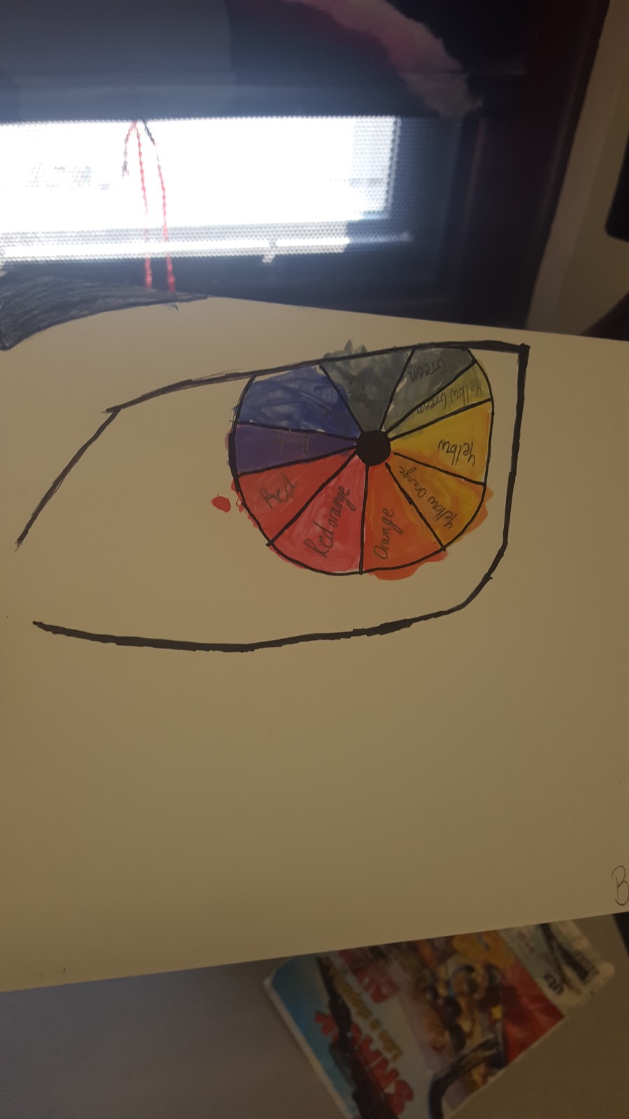
Eye color wheel
I created an eye. I had an unrealistic animated style eye though. I chose to do an eye because it was more than just a circle. I could be creative and that’s why I didn’t make a normal realistic “boring” eye. My vision for the picture was to have fun and be different. I know other people did eyes but I feel as though my eye was different. I don’t know how the audience will react.
This relates to my previous work because when I draw a person they have to have eyes. I always wanted to draws eyes like the one I drew but it seemed difficult to get the proper angle I wanted. This time I just drew it and it came out how I wanted. I don’t know what contemporary art is. My work doesn’t really fit in with the history of the art we did in class. We never really drew eyes or anything related to humans. An inspiration for my eye is when I looked up cool eyes and a character from a show popped up. I’ve been influenced by a lot of cartoonists. I really liked drawing and when I was younger I drew my favorite cartoon characters. I didn’t learn a new technique but I did learn how to draw a cool eye.
So overall I created my eye because it was interesting and unique. I was influenced kinda but it was all mostly my thought. I like the way it cam out but I don’t like the colors when I painted it.
One point perspective
6 word memoir: Nothing matters except money and Basketball.
Backstory: Brian Bess 15x NBA All-star,8x Most Valuable Player, 4x defensive player of the year, 2021 Rookie of the year and future NBA Hall of famer. He has stacks of money around in duffle bags, expensive furniture, a 70 inch Flat screen Television and a ten foot tall Basketball court in his room. He wanted to be the greatest basketball player of all time. He aspired to live a luxurious and great life and has finally succeeded.
Art picture
What is the meaning of the work you created?
What inspired your work?
Why did you choose the location you chose?
How did this project change your perception of Art?
How did this project change your perception of Art you see as you travel around the city?
The meaning of the work I created is self enjoyment. I had to do this assignment but I enjoyed drawing this picture of a HellHound. The thing that inspired my work was a character on the show Teen Wolf. This is what I believe he’ll look like if he transforms completely. I didn’t chose a location yet because you collected it and I never got it back.This project did not change my perception of art. It also didn’t change my perspective of art I see around the cityTech project
In slide 1 my word was anonymous. It was anonymous because if I posted online I would be unknown.
In slide 2 my word was don't. I chose don't because my online choices don't affect me. I don't do anything positive or negative online.
In slide 3 I chose the word doesn't. I chose doesn't because my online choices don't affect other people nor myself.
The Internet And You
Tech survival guide
Brian Bess 11/13/15
West Stream
Tech Survival Guide
I’m a nobody online, so as a result I appear as nothing or no one.
They don’t know I’m there. I don’t post anything online. The pro’s of being public online are people you know can see what you’re doing but a con is people you don’t know can see what you’re doing. I dont know.I feel as though social media backround checks are pointless. What certain people do out of work has nothing to do with being in work. The only way it makes sense is someone takes a picture of them slacking at work.
Free speech is when you can say whatever you want generally. Certain stuff is protected like yelling at the president and voicing your opinion but slander and bullying are not. An internet troll is someone who gets online just to bother and make fun of people or a certain topic. The goals of internet trolls are to put people down and to make fun of things. I dont know how to stop internet trolling. The pros of posting anonymously are no one will know that you said something, a con is that if you do something someone wants to acknowledge you for they don’t know who to acknowledge.
My top 3 tips are:
Don’t post anything you don’t want people to see
Think about your actions
Don’t troll on people’s pictures