• Log In
  • Log In
Science Leadership Academy @ Beeber
Science Leadership Academy @ Beeber Learn · Create · Lead
  • Students
    • Hand in Hand - Markus C
    • Mark's Natural Disasters 101 For Idots
    • SLA Portal
  • Parents
    • About SLA Beeber
  • Calendar

Art 2 · Hertz · d1 Public Feed

Create a Post

Ice Cream

Posted by Imani Horne in Art 2 · Hertz · d1 on Thursday, January 19, 2017 at 10:22 am

I chose to do the sculpture project because I felt like it would teach me a lot of things other than just art. This project taught me to be patience and that your first time doing something isn’t always going to be perfect. Sculpting takes time, lots of time which are why you need the patience to see your best work. On the art side, it taught me how to sculpt which I did not know how to do before this project. Doing this project I was hoping to achieve a nice piece of work. Overall it looks okay but not exactly how I wanted it to. Through the project, pieces were falling off and cracking and then my colors didn’t work out how I would have like them to. But it still looks nice and creative to be my first time sculpting. Whoever looks at my art will see it and think of food, desserts. The whole meaning of me sculpting this was to be about some type of food and I chose Ice Cream. 
In this project, I achieved a lot of things. I felt like as long as the base of my project held up then everything else would be fine. This project also helped me achieve a little patience because when your working and pieces start to fall off you get mad but then you realize that you just have to remain calm and try to make it work and whatever it comes out as it will still look nice and hopefully people will get the picture. My other project (the color wheel relates to this because before I did the circle color wheel my original drawing was a cup with a drink and as it goes down the color would get darker but that didn’t work out. SO what I am trying to say is that if it would have worked out most of my work would have been in the food industry. 
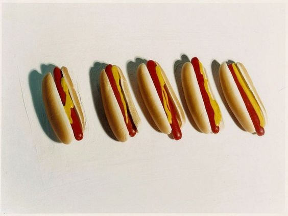
My work fits with someone named Sharon Core.  Shannon core did a picture of multiple hot dogs. I'm not sure what he did it but I'm sure she did it for the same reason I did. She either loves food or because she never really sees the art of food. I never really see works of art that are about food. 
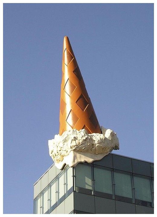
Trying to create my project I took up a lot of time figuring out what I was going to do and how I was going to do it. But then I realized that I needed to just start. I then took out some clay and began to mold it into a flat piece of paper. Next, I round the sides so that it looked like the shape of a tortilla. After that, I just rolled it slightly so that it could shape into a cone. Then there it was a perfect cone and I decided that I wanted to make it look like a waffle cone. So I made lines in and left it alone. Then I began to make my Ice cream like the scoops. I wanted a melted look so I then rolled them into balls and added a thin piece of clay on the edge to make it looked melted. I then let everything dry, I painted it and I didn’t like the colors so I painted everything Brown to make it look like chocolate everything. The Ice cream is chocolate marble and the cone is chocolate fudge. I searched google to get my idea. I wanted my sculpture to be a cake and with a melted ice cream cone on top but as I went through the project I realized that it was a bit too much. http://tinyurl.com/hc8e9o3, http://tinyurl.com/zw4cdrd, http://tinyurl.com/zyonc8y Below are some pictures that inspired me to do this piece. 
art ice cream images (1).jpg
99download.jpg
art -- Ice cream .jpg
My art reflects the world I live in because mostly everyone loves ICE CREAM and in the world, we live in everyone LOVES TO EAT. 
I’m not really sure how my artwork could have an impact on the world other than to tell people to eat/ Eat more Ice cream who wouldn’t be good because there are already a lot of people in this world who are unhealthy. Doing this sculpture project it is important to take your time and have everything planned before you start. It is very important to be calm and to stay focused. 
It is also important to make sure everything is smoothed out. When it’s smoothed out there is a lesser chance that it will crack and break. You can make it smooth by rubbing water on it until you see it smooth like a piece of paper. Put water in a little cup and add some clay to make it slick and then you rub it on your work and smooth it to your satisfaction. That is something that I learned at almost the end of me finishing my art piece. 
In conclusion, this project has taught me many things. Doing this project I was able to make mistakes or break something and not be mad because I know that to every problem there is a solution. Doing this you have to have patience or nothing will work out in your favor. This project was fun and If was able to do it again I would and I would change a lot of things that I did with this project.

20170119_103117
20170119_103117
Be the first to comment.

Spooky Forest

Posted by Imani Mumin in Art 2 · Hertz · d1 on Thursday, January 19, 2017 at 10:19 am

I created the linoleum cut because I simply wanted to try something different. I felt like it was something I didn’t think I could do so I wanted to try it. I wanted to create an image that people could make up their own story from. It is an image people can interpret in their own way. I think people would mostly see it as something spooky. Something you would see in a cartoon movie where kids are  trick or treating on a Halloween night and go into a forest for more of an adventure. Doing this project I think I created more of an imaginative mind for myself. I feel like my work doesn’t relate to my previous work because I feel like my previous work wasn’t much creative. I think my art relates more to David Hockney art because he did a lot of landscape art with painting of trees, woods, and towns with farms land. I feel like that is the type of art I was working towards.


Linoleum cut process was easy. First I had to sketch out an idea of what I wanted to crave and I had to make sure the image would be able to fit on the linoleum so that was challenging. After sketching the picture I had to print it on the linoleum using carbon paper. When it printed on the linoleum I then had to go over the image a black sharpie marker. Then I had to heat up the linoleum with a iron so that it would be easy to crave. The I began to carve the part of my image that wasn’t gone over with the sharpie. After I was finish craving I then had to print my image on a piece of paper using ink and a roller to roll the ink over my image so that it will print of the paper.


My inspiration while doing this picture was a picture of David Hockney’s named The Road Across the Wolds, 1997. My work reflects the world I live in because it allows artist to branch off and try things they aren’t really use to doing when it comes to art. It can make artist realize that they aren’t just creating a picture and that it is more to what they are doing. A technique that is important that I learned is drawing the image out on paper before you print it on the linoleum because it helps you be sure that the image will fit.
20170119_101159
20170119_101159
Be the first to comment.

Quarter 2 Art project

Posted by Nathan Lewis in Art 2 · Hertz · d1 on Thursday, January 19, 2017 at 10:14 am

In my Art class each student got an opportunity to design their own project. We were given options from different varieties of  Art pieces that we had to choose one. I chose the value line and texture drawing because I’m more comfortable with that type of Artwork and I think it would be easier for me.

When I started brainstorming I knew that I wanted to draw the face of an Animal, so I decided to draw the face of a dog, but it wasn’t coming out how I wanted it to and I later changed my mind to draw the face of a Lion.

I drew a Lion, because Lions are a very strong and fears specy. I’ve always told myself that I have the heart of a Lion, but I want when people look at this art work they find their own meaning, because this is art and different individuals should be able to have their own insight.

What I really like about this drawing is the eyes, I feel like the eyes gives it a realistic look even though it doesn’t look a 100% real,because I did have some problems with the hair and the background, but otherwise from that I think the facial structure was somewhat good enough.


IMG_2055 (1)
IMG_2055 (1)
Be the first to comment.

Manatee (By:Yarisnel M Rosario)

Posted by Yarisnel Rosario in Art 2 · Hertz · d1 on Thursday, January 19, 2017 at 10:10 am

Artist Statement


When I was in the process of choosing what type of Multi Media I wanted to create I wanted to chose something that showed who I was in a way and something that would challenge me. I looked through the materials I had and saw clay. I chose to do clay because is a very hard material to mess with for multiple reason. Once I had my material I started to think about what I wanted to make. I knew I wanted it to relate to me in some way so I decided to do something with the ocean. I looked through animals and then picked to do a manatee. As I drew a sketch of what I wanted to sculpture to look like I wanted it to show what a manatee looks like and its environment. I believe that with my sculpture the view can clearly tell the message in the sculpture and what animal it is. While I made my sculpture I got to understand how clay works. My work fits into contemporary art because it's abstract and different.


To make my project I use basic shapes like circles and manipulate them into a different shape. I molded my clay and use tools to smooth it out and to create other textures. . I got my inspiration for this project by looking up pictures of manatees and other sculptures of manatees. These are some pictures that I got inspiration from. Picture 1,  Picture 2, Picture 3, Picture 4. I think that my art relates to the world we live in because with global warming becoming a big concern and animals becoming endangered i think my sculpture reminds people of the beauty in these animals.


IMG_0921
IMG_0921
IMG_0920
IMG_0920
Be the first to comment.

Value, Line and Texture Drawing -Sakura

Posted by Sakura Seals in Art 2 · Hertz · d1 on Thursday, January 19, 2017 at 10:07 am

SakuraS
SakuraS

The project choice I choose to do for my Q2 benchmark was Value line and Texture Drawing. I decided to choose this because I wanted to create an image that uses various techniques that would make my drawing realistic. When thinking about doing this project I had many different vision and ideas of what I wanted to do. I had did 2 rough draft of sample drawings I wanted to do. The first idea I had, was for me to do a one point perspective drawing of my name. The second Idea I had was to do a necker cube illusion. The reason why I didn’t go through with those ideas was because I didn’t like how the drawing turned out. I finally then decided, that I wanted to draw a human skull because when I was looking up realistic human skull drawings, I like what I saw and I decided I wanted to make a skull drawing. I think my work communicate to the viewer because of realistic aspect of the drawing. I think I achieved the realist aspect of the skull drawing. My current work relates to my previous work because I have done a value line and texture drawing in the 9 th grade. We had did still life drawings.


I believe my work fits in with contemporary art because of portraiture art work. When I looked at artwork on artsy.com I saw portraiture and when i had clikced on it, I saw that it was portaits and relaistic drawlings  that looked simlair to my darwling. When I finally decided to draw a skull for my benchmark, I had went online to looked up different skull ideas I could draw. When I found the one I thought I could replicate, I went on youtube to see different examples on how to draw a skull. I also watched some drawing videos about shading. When I had got an idea of what I wanted to draw a had started to draw my rough draft  to see how the skull would turn out. After I was done my rough draft I pretty pleased with what I had. However when I was working on my final drawing I realised that something was missing that would make my skull different from the skulls I saw on the internet. I then decided to add bones inside the skull mouth to make it look like a pirate flag symbol.My inspiration came from google because I was looking up different ideas for realistic drawing and I saw a skull which I thought was pretty nice. My work could have an impact on the world by showing people they can and try new things like I did when completing this project. My work could influence people to step out their comfort zone and try new drawing techniques. A certain technique I used in my drawing was the shading. When shading in the skull it gave it more value and realism to it which I think is really cool. I learn how to make different textures with a pencil and how to shade had realism to the drawing.


Be the first to comment.

Q2 Art Project

Posted by Cyrus Foster in Art 2 · Hertz · d1 on Thursday, January 19, 2017 at 10:01 am

IMG_0235
IMG_0235

We wanted to do something that is similar to the project choices mixed with something we really like to do.  Our overall vision for the work is to mix and older style of artwork with a newer style of art. Henna is an older cultural art and it is very detailed. Graffiti style lettering is a very new form of art. When you put these two together it creates something new that you rarely see. The message that we are trying to send is that nothing should be stuck in it’s category and trying new combinations can turn out well. We made a unique artwork and that is not seen a lot. Practicing on the henna designs and also the lettering help us a lot. I like working with 3-D art and street art and this is mixed with a little of both. Our artwork is similar to  ZADIE XA because the  work is very detailed. First we sketched out where we would do my henna designs and then I started with a little flower into a big henna designs over all the buildings. I make a sketch in my book then I drew it on the canvas. I colored it in with acrylic markers and went over it again with another layer of acrylic paint. Our work shows Philadelphia which is the city we live in.  It could make different artists get together and collaborate to make new ideas. Without shading the lettering wouldn’t look the same. The shading makes the letters 3-D. It it was all white it would be very hard to read and look very flat and basic. I learned to go back over my paintings with layers of paint which is something I didn’t do before. I hope everyone likes our art work.

Henna Design by Shirin Akhter

Graffiti Lettering by Cyrus Foster


Be the first to comment.

The Wolf Pack

Posted by Abdulomar Tucker in Art 2 · Hertz · d1 on Thursday, January 19, 2017 at 10:00 am


Abdulomar Tucker

.


To begin, I created a linoleum cut wolf because that's my favorite animal and I wanted to make an animal.  After deciding that I focused on my vision for the work. I wanted to make a wolf with a moon in the back. I think my work would communicate deep thinking and even appreciation for a wolf in it’s glory. With this, I will be able to really capture this wolf. This project relates to my other projects in which the ideas come rather spontaneously. The original strokes I put into my artwork is the same as well. After reviewing some contemporary art, I noticed that my artwork is very similar to Wolfgang Tillmans. Wolfgang and I tend to see beauty in the little things and things people would really overlook. Things that would be taken for granted and where others don’t see the light in something. His artwork is also spontaneous as it captures either current emotions or moments in life. When creating this project, I had looked at some wildlife pictures of Wolves. I just decided to add a moon behind it to make it more special. This project doesn’t reflect my own life;however, the wolf in a multiple ways reflect some things i instill in myself and what I see in the world. Like when chasing a goal , I imagine being as serious and making every move towards that goal as purposeful as a wolf hunting to feed the pack. I also like what the wolf represents such as integrity and bravery. I feel as though my work can influence people to take some valuable lessons from this and change a life.  The most important technique is the specific knifes I would use to create certain cuts that would come out in the print. This technique is also new to me. I had fun experimenting  with it.


All in all,  Creating the wolf was a spontaneous idea which is similar to the style or creation process of Wolfgang Tillmans artwork.  The wolf itself does have individual importance to me and I hope people can take something away from this
IMG_1687
IMG_1687
Be the first to comment.

Lady of Color

Posted by Ashley Bailey in Art 2 · Hertz · d1 on Thursday, January 19, 2017 at 9:56 am

This quarter I have challenged myself to make a piece of artwork with a style that I have never done before. Mixed media was new to me, but I enjoyed creating this piece. My overall vision is actually amazement. I really was aiming for something very colorful and I definitely feel like I have achieved that outlook. At the beginning, I had no idea what techniques of mixed media I would use, but the three that I have chosen worked out perfectly fine. As my main materials I used tissue paper, sequins, and pompoms. These object all come very colorful.

I started out with this idea of being having color pop out of the work. I started out with painting white first just because that made sense to have that dry. I then went onto the background of tissue paper and I made my way on down. Nothing was really planned, I simply just laid out the tissue paper, the pompoms, and the sequences. There was no particular plan for where I wanted things to go, I just knew the space that I wanted things to go in and from there I just used up all the space that I sketched out. Along the way I learned I should cover the space that I may not want to get messed up, because when I went to melt the crayon it spilled over a bit on a space that I did not want it to. Fortunately, I was able to fix it up but I now know that when dealing with liquid materials I should cover up parts just in case for a spill over. As far as learning something new, I can take away the importance of probably knowing the quantity and the exact of mapping things out. I was a bit under prepared with pompoms and I had to run out and get more in order to complete the project.

This work just like my other work tends to be very different and stand out to the eye very well. Bella Szeift is a great example of my work comparing to contemporary art work. Her piece of art, Lace Maker was the first piece of work that I saw on the paper that made me think of my own art work. I see a face resembling out of different objects which is the concept of mine. There is a face inside of the objects that were used. Her work is very bold and colorful and I feel that my piece of work transpires the same views.

Overall, my work came out as expected and I am proud of it. There was no reasoning or inspiration behind the thought of making this. I literally have none tried this and found the thought interesting to try. I have learned that you can take just about anything and turn something into art. You can use different tools into a masterpiece. Beings though my artwork is a girl and she is bold and colorful, this idea can be inspirational for other women to really stand out for themselves.


IMG_0270 (1)
IMG_0270 (1)
Be the first to comment.

Shirin Akhter & Cyrus Foster- Art 2

Posted by Shirin Akhter in Art 2 · Hertz · d1 on Thursday, January 19, 2017 at 9:53 am

We wanted to do something that is similar to the project choices mixed with something we really like to do.  Our overall vision for the work is to mix and older style of artwork with a newer style of art. Henna is an older cultural art and it is very detailed. Graffiti style lettering is a very new form of art. When you put these two together it creates something new that you rarely see. The message that we are trying to send is that nothing should be stuck in it’s category and trying new combinations can turn out well. We made a unique artwork and that is not seen a lot. Practicing on the henna designs and also the letterings help us a lot. I like working with 3D art and street art and this is mixed with a little of both. Our artwork is similar to  ZADIE XA because the  work is very detailed. First we sketched out where we would do my henna designs and then I started with a little flower into a big henna designs over all the buildings. I make a sketch in my book then I drew it on the canvas. I colored it in with acrylic markers and went over it again with another layer of acrylic paint. Our work shows philadelphia which is the city we live in.  It could make different artists get together and collaborate to make new ideas. Without shading the lettering wouldn’t look the same. The shading makes the letters 3D. It it was all white it would be very hard to read and look very flat and basic. I learned to go back over my paintings with layers of paint which is something I didn’t do before. I hope everyone likes our art work.

Henna Design by Shirin Akhter

Graffiti Lettering by Cyrus Foster


IMG_0235
IMG_0235
Be the first to comment.

Project 2-Mixed Media

Posted by Kashia Bumpess in Art 2 · Hertz · d1 on Thursday, January 19, 2017 at 9:47 am

art pic
art pic

I chose this because I felt like this was the most challenging project on

the list and It was different. I was hoping to capture the three different media’s in my project and really be able to bring them out. I think my work communicates to the viewer because I drew something everybody likes. I hope to do good as an outcome of this project because I never did something like this before.

This relates to my previous work because in my previous work I went

outside of my comfort zone and tried something new. I gather my materials first which was difficult because I couldn’t find three different media that was going to work on the board I was using. Then I sketched out my sunset on the board. Then I painted the ocean first.I used acrylic blue and white paint. Next I filled in my sun with 2 different color constructions paper yellow and orange. Lastly I used a white substance and filled in my palm trees then I went over it with color pencil brown and green so it can really show.  

My world could impact the world because It could make people want to try something new. A new technique I experienced with was using construction paper to fill in my sun I always used marked or coloring pencils, etc.


Be the first to comment.
103 posts:
← Prev
  1. 1
  2. 2
  3. 3
  4. 4
  5. 5
  6. 6
  7. 7
  8. 8
  9. 9
  10. 10
  11. 11
Next →
RSS

ART_2-002

Term
2016-17

Other Websites

Launch Canvas

Blog Tags

  • Art 2 1
  • Final submission. 1

Teacher

  • Mary Hertz
Science Leadership Academy @ Beeber · 5925 Malvern Ave · Philadelphia, PA 19131 · Ph: 215-400-7270 Fax: 215-400-7271
×

Log In