Blog Feed
in schools , is discipline racist?
In schools, is discipline racist?
Wealth
Racism in Housing
African American Employment
In school, is discipline racist?
Environmental Science PSA
Reflection
The video my group did was on the textile industry. We chose this because it is something a lot of people don’t talk about, and we were interested to learn more information about it. The textile industry is something that is involved in our everyday lives and I did not realize how much it affected our environment.
For the project we did it in the form of a talk show. I helped write a lot of the script, research information, and helped film the video. I think we did a good job filming and finding out good information on the topic. Something I would of done differently is not let anyone else in the room while we are filming as it was very distracting.
The most meaningful part of this to me was being able to create a video sharing a good message with my friends. It taught me more about using the cameras and I learned a lot about a topic I did not even realize was a problem before.
Art - Charcoal Piece
Tykeiah Martin
Ms. Hertz
Art
Artist statement
December 20. 2017
My art piece essentially represents the thought, of overthinking. Starting off with a head, specifically the perspective of the side of the face. Leading to a person sitting on top of a head concluding them to also thinking. The thinking person lies on top of a thinking head. Portraying a lot of thoughts. I would like my work to communicate for those who are looking in, is that I'm an artist who thinks a lot about everything and the image of a thinking person on top of a head, visually shows my idea of overthinking. The tools that were used to create this image were a charcoal pencil that shapes the head and the person on top of it. While outlining the art with a white charcoal pencil, to add attention to the person. Also, I used Conte crayon for a darker outline. Leading to the smudge stick with smoother lines in the photo. Lastly, creating this drawing on textured paper. With an edgy effect. I think my old work relates to my new work because often I use the charcoal materials and it’s wrapped also around the mind and me personally. When created this picture, first I stepped into creating the side of the face and looking for the right angle. Then I created the body sitting on top of the head to show a feeling of the body simply relaxing in the process of thinking. Next, i started to shade around the body on the head to show thoughts prospering on top of the body around the head, concluding the ideas altogether. Then I used the smudge stick in 7 out to smooth out the thoughts surround the head of a person, next I began to outline with the white charcoal. Salvador Dali is an artist who focuses on surreal, which is what my art is most likely compared to. I think a certain technique is important to the work to enhance your quality and create the image that you see in your head for others to visually see from your perspective. A new technique I learned was starting off darker shade leading to lighter shade from smoothing it up and down. I'm most proud that I was able to reflect exactly what I was thinking on paper, and now I can let others have a look at what I might be thinking. If there was one thing is could change about this picture is the shading I used around the image. Throughout the completing of this art project I learned to justify what you want, and it can be however you prefer to cause it's yours, and if you use the right utensils everyone else can see your vision as well.
PSA on Lead Poisoning:
Our video is generally a PSA informing people about lead, the effects of it, and what they can do to help the problem or prevent the problem whether it be themselves or children. I really enjoyed being able to do such seeing that I choose this project because of my very high interest in the lead problem ever since learning it is a major issue in philadelphia alone. While creating this project with my group members I was able to provide layouts, plans, and ideas on how to reach our audience which I believe I did very well and helped my group succeed. Overall the most meaningful part of this project was being able to reach out to my audience and help them become knowledgeable.
Link to video: https://www.youtube.com/watch?v=8Sa7ZfRjoRQ&feature=youtu.be
Lead Poison PSA
Link to PSA: https://www.youtube.com/watch?v=8Sa7ZfRjoRQ
My group's PSA was about lead poisoning and that dangers that it can cause, as well as what causes it and what we can do to prevent it. I agreed on the topic of lead poisoning because, as we learned in a previous unit, it is a very serious issue. This environmental issue stood out from the others because it affected you directly in your own home. The affects that it has on families is devastating, and I felt it was important to talk about.
For this project, I recorded the introduction and filmed the outro, and was in charge of the video editing. I enjoyed editing the video and bringing all of my group's clips together, and I feel that it turned out well. If there was something I would change, I would add transition clips in between each segment. I feel as though it would add more to the PSA. However, the moving images which were used in the project helps to keep the viewers entertained, and overall they got the message across. My favorite clip was at the end, which was a clip of my younger cousins presenting what they knew about lead.
The most meaningful part about creating this PSA was knowing that the people watching it will be better informed about a serious issue. Lead poisoning can greatly damage your health, and cause developmental setbacks in children which can affect them for life. I want to spread the word about this issue, so that no one's life will be disrupted by lead poisoning anymore. Hopefully, the message will be spread and the issue will be solved.
Pope Quarter 2 Still Life
I want this piece of art show that I can really draw if I really put my mind to it. I used pencils to draw the outline of my drawings and I used different types of pencils so that I could shade my stil life to make it look more realistic. Compared to the self portrait that I drew in the first quarter for this class I think I improved a lot considering the fact that it looked like a elementary kid could draw it and now it looks a lot more professional in my opinion. I learned how to shade piece in a drawing to make them look realistic. I am most proud how my work came out I didn’t think I was going to be able to draw the two fruits as nicely as I did. If I could change one thing of this project is the detail I would want to make it as realistic as possible which I don’t think I accomplished.
Limited palette
My artwork The first you will see in my image is the black stem with round ball-shaped flowers. The round balls are different shades of blue. The background is a light sky blue, painted streaks. My tools included a very thin brush, that was used make the think strokes of the stem. Next, the tool was a medium-sized brush to paint out the circle balls. Tool #3 was my five watercolor colors. I chose red, black, white, blue, and yellow. I chose primary colors because I knew I could make a lot of other colors and shades. A certain technique that is important for watercolor painting to have a light hand. It’s important because you want to use too much paint and less water because it will lose its purpose of watercolors. A new experiment I learned was you can use the water you dipped in your brush as the watercolor as well. Than typically just using the mixture you have on your palette. I learned using watercolor can be more than using just a brush but you could use other objects creates different textures.
Q2 Final Project Submission
My artwork is a crown. This was apart of the mixed media project. I created a crown to explain royalty and the feeling of being a queen. A queen feels the sense of love, worship and amazement. Looking at my crown you notice the glitter showing the idea of happiness. Also the sturdiness reminding you of the strength from the people around the queen making sure she’s safe and happy. I used cardboard, glue, glitter, pastel, construction paper, jewels, and puffballs to create my crown. I wanted to portray the idea of someone's confidence and readiness to conquer anything by wearing my crown no matter if it’s appealing or not you can still wear it and be confident. Having confidence that you’re still great in a bad position no matter what you look like on the outside.
My work connects to my culture because me being African American and I believe that they are African queens who resemble royalty through my crown. knowing that there are African queens my crown resembles the royalty and connection to the culture it self. It also connects to my live and experiences because everyday you go on you should always feel a sense of royalty like you’re a queen or king and are great. Also as though you should be respected just as well as anyone else. The way I used my tools is the glitter throughout the crown to show a cheering mood. I used the pastel to spell out neej on the front knowing that the crown is specifically mine. I put jewels around the tip of the crown showing the wealth of a queen. Lastly, I used the construction paper and the cardboard to create the crown and it’s sturdiness.
This compares to my previous work because I have confidence in everything I make and this shows the confidence I am not the best artist but I try and believe in my work. An artist I connect to is Johannes Vermeer because looking at his artwork you notice a pinch of blue in every painting and blue is a color showing royalty. A certain technique that helped me was making sure I used my materials together and try everything. I’m most proud of the purpose of my crown. I would change the look of my crown make it a solid color. Throughout this project I learned that you should work at a certain paste and maintain the same ideal look all the way through.
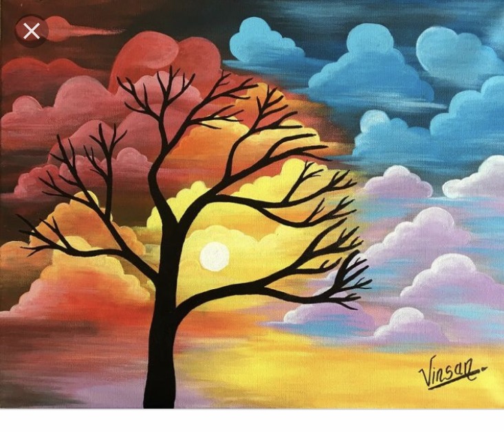
The Tree of Life
The inspiration for my project came from a saying, “The Tree of LIfe”. I painted a picture of a tree in the middle of empty land. The tree is painted normally and it has a background that is dark blue with paper clips hanging from it getting shorter as they go with intentions to make the clips look like steps but they are supposed to be tree swings for the context of the painting. I decided to to paint this picture because I felt that it currently represents my life. The steps are meant to represent the different stages in life that I have been going though. This project is a mixed media project and for my different medias, I used wood in which I cut myself to use as my canvas. I then used white paint to cover the entire piece of wood and I continued to paint my tree and grass using green and brown. I painted my background dark blue to make the tree pop and because I felt that the color was mysterious, like life itself. Compared to my previous work, this is somewhat different because of my choice to paint. I usually draw or color everything but, as far a conveying a message, I always try to convey a message. When doing my work, I noticed that the way I painted was an important technique because cleaner strokes made my art look better in my opinion. I’m proud of myself for sticking to my idea and I surprisingly, I’m satisfied with the outcome, so, I’m proud of myself for beginning to have confidence in my work which is something that I've learned to do, love my work because it is my creation and I’m sometimes too hard on myself. As always, if I could change anything, it’d be to manage my time better and try not to miss classes because it affected how much of my project I was able to get done. I found a painting by Vinsan that somewhat reminded me of my art because of the painting techniques and focus on nature.
Q2 Final Project
Artist Statement:
In my project I chose to create a clay flower. I decided to make a large flower with a lot of petals and chose to make it purple. I chose this because these are two things that I like. To create this, I used clay, acrylic paint, and clay tools. I took small pieces of clay and used my thumb to shape the petals. Then I placed the petals all on top of each other until I was happy with the flower shape.
An artist that inspired me was Rachel Kneebone. Her work is nice and you can tell she put a lot of time and effort into creating her pieces.
The most important technique I think was how I created the petals. I tried to use the same amount of clay and tried my best to make them the same shape and size while creating them. A new technique that I learned was how to shape the clay. I thought this would be an easy project going into it but quickly learned that it takes a lot of time and patience.
Something this project taught me was to become more comfortable while working with clay and has helped me become a better artist.
Tree of Life
My work is called the tree of life through the use of only 5 different colors (White, Blue, Black, Red, and Yellow). The basic description of this work is that it is a sitting tree in a moon, on space. With Astor bodies (meteorites) and stars surrounding the tree. In the backdrop of the painting it has a blue-ish shine to the tree. I want for my work to represent the ever living tree of life, ruler of life and space. I am very scientific and because Earth is the only planet in our universe to have life I wanted to put the tree of life as a celestial being of some sort - Making the tree special in a way. When I was painting the tree I used a pencil to trace the tree and overall design of it, I used three different brushes from thick to thin, a canvas (made of wood), a pallet, and five colors (blue, yellow, red, black and white) which I mixed in order to make any other color I wanted. My current work can relate to my previous one in a sense of location/ scenery. They are both located in space and have a “spacy” theme. My colors are different however, as this current one is more eye popping then the last due to the variety of colors.
When I was making the painting I first started with a drawn outline which I could then color with paint. Then I used a thick brush to make the outline of the moon and space, after that I painted the tree, making the roots and small details of it. After that, I painted the astro-bodies to give depth to the painting, which worked however, currently they pop- too much, which is something I want to fix about it, and that was how I made the painting. In my personal experience, outlining a painting with a pencil should be the very first step that you should take as it would make your work easier to make and you won’t have to think how to do “this and that”. I am most proud of how I managed to make good astro-bodies and a very nice tree. Which was something that I had always had a hard time with. If I were to redo or change this project I would probably delete some stuff of the drawing like the moon and stars, even though it would give it an emptier theme. It would just be more organized and neater. In conclusion I am proud of this project and would likely follow the same steps that I made here, in future projects.
clay man
For Q2 Art I had the idea for the clay project to make a person for my porject taking
inperation from some games and tv shows I look at, so I came up with the idea of a guy holding
A radio in one hand and a hammer in the other, he weres a pack with tools a nd air the outfit
Is to protect aginst harmful subscenes that could kill the person as for colors I had a palette
Of red white & black colors mixed in their to give off this govenment feel of person with the white
On him
Artist Statement
For my project this quarter, I did a still life drawing. The two items I drew were grapes and seashell behind it. I really tried to focus on the texture of the grapes and capture that in my drawing. Something I want to communicate through my piece is the detail in the work. It is something I am proud of.
When I was working on the rough draft of the picture, I just used a number 2 pencil to sketch it out. When I wanted to do the shading I used a pencil with a different type of graphite. They made shading the grapes much easier. They were a softer touch and easy to draw the lighting of the grapes. This work relates to work I have done in the past because I have done still life in the past. It was similar techniques I had to do to capture the look of the object.
Our first nt was to sketch a rough draft in our notebook. After working on that one we had to make another one before starting the final product. The first rough draft I made did not get finished. I only got half of the grapes shaded in. The second one I was able to finish the whole thing. The leaves and the grapes all got shaded in.
An artist who makes similar work to this is Willem Kalf. A lot of his paintings were still lifes of fruit. His are all paintings and mine is not, but they have very similar shadings.
http://www.artyfactory.com/art_appreciation/still_life/willem_kalf.htm
When I was coloring in the grapes, I started coloring in the circle really dark, and continued to get lighter and lighter till the tip of the grape. I wanted to get the light bouncing off the grape, and I think that captured the look.
It took me a few times to get the leaves of the grapes down. In order to capture the lines in the leaves, I had to color in the leaves and stop coloring where the lines would be. That is what gave it more of a realistic feel. Something I am proud of how the shading on the grapes turned out. I think the shading makes them look realistic.
If I could change one thing about this project, I would want to start the second object earlier. I forgot that we had to use two objects, so I only did the second object on the last draft.
Something I learned during this project is multiple drafts is an important part to drawings. Even if you like the first of your drawing, you should do a new one to your skills and see if something comes out better. You can always go back to the first drawing, but if you don't make new ones you have no chance to improve.
Landscape Mixed Media
For my project this quarter I choses to do mixed media, which made me use different media in a way that I never have before to form one individual piece. The criteria for making this piece of work was that I had to use at least 3 different medias.
When starting to form my ideas as to what I was going to make, I started out by thinking about the different medias that I wanted to use. I thought about a lot of different things but in the end I decided that I wanted to use newspaper,string,paint, construction paper, and glue. Once I had the materials down I thought about what I wanted to make. I thought that the materials would make a good landscape picture . After that I got started using the materials and seeing how they worked together. I wanted the background of the picture to have the newspaper and than I would paint over that to make the grass and sky and things. And lastly use the string and paper to add to the picture making clouds and more grass.
Finally once my art work was finished I was most proud of how my materials work together, especially the newspaper background and the paint. I think that the newspaper background made my artwork special because it made the texture that I wanted. If I had to change one thing about my artwork it would be that I would move the sun to the middle on the horizon line. Other than that I think that my artwork turn out very well and I learned that I just have to trust the process in which I work and it will all work out.
Artist Statement
There is three simple objects in the photo. A dark brush on the left side with many bristles. A water bottle in the middle and a regular light brush with an average amount of bristles.
This is based on my personal experiences. These items are the thing that I carry everywhere with me. This could also be considered to be part of me, my identity. Without these items I may even be a different person. I know it may sound like a scratch but it is the truth.
For this artwork I didn’t really used that many tools or materials. I had a piece of paper, a pencil, hard pencils, and my fingers. Let me start with the oddest one first, I used my fingers to gauge the size difference amount my objects and try to replicate it. Then, I used my pencil to sketch and shade my objects. Of course I used the paper to make the art.
This follows my previous work is by using less about of materials needed.
To make my still life. I first had to set up my still life. One brush on the left, a water bottle in the middle, and a brush to the right. The first thing I started to draw was the water bottle, since I felt like doing the middle object would be easier and helpful for me to draw the rest. After doing that, I made the negative space among the objects making sure the size differences were the same. I quickly made both of the brushed. Then, I added more details to the objects, later shading it.
It wasn’t an artist that inspired me to do this. It was a Youtuber 360jeezy. It was a simple fact that he had great waves and he helped others to get waves. SImple as that.
One thing I was focus on was to draw the negative space among the objects because have that you would have all of the same shapes you wanted.I started to use the negative space technique a whole lot more, and I am grateful that I am more experience with it. I liked that I improve on the art each time I made it.I wish that I could of made the wood material more noticeable because I thought I didn’t to a great job with it.
I think still life help me to gauge the difference of sizes among the objects and rely on the power of negative space.
Charcoal drawing
For my quarter 2 project, I chose to do a charcoal drawing of a tall thin vase type of object. First, I did my rough draft on a blank sheet of paper. After completing my rough draft and figuring out where all the shading should be I went on to my final copy. I chose to use newspaper to draw on because I wanted to try something different. I used 2 charcoal pencils (1 black and 1 white), 1 regular pencil, 1 kneaded eraser, and 1 smudge stick. I first outlined my drawing and shading with the regular pencil. Next, I used a light shade of black charcoal created by lines going in the same direction. I followed up with more layers going in different directions to create darker shades wherever it was needed. Finally, I used the kneaded eraser to remove black from light spots and went over it with the white pencil. It was very important to wait for everything to be complete to start smearing the charcoal because the drawing could be easily ruined. I used the smudge stick to smoothly combine the different shades. That final step made the drawing come to life and look more realistic which relates to my style of art. I am proud of this because it relates to some of my other artwork but it’s different at the same time. I like using shading to create realistic effects but I never really tried it by trying to draw an actual object. The idea of this actually came from Guy Denning who does charcoal drawings on items such as newspapers and boxes. If I could do this project again I would probably draw more than 1 object to make the paper looks more full. Through this, I got a better understanding of how to use charcoal as a medium to create artwork.
Q2 Final Project Submission
For my Q2 benchmark, I decided to work on a still life drawing. The goal of this project was to create a representation of 2-4 inanimate objects. This representation must be done from life, and not from your imagination. For my still life, I decided to draw a stack on books on type of each other with a piece of paper sticking out between the books. I want my work to communicate to the audience how drawing can really bring something like a still life drawing to life. This work really does not reflect my culture in any way. However, still, life drawing has been done throughout art history.
For my still life drawing, I decided to keep my picture blank and white. I wanted to challenge myself to see if I can just use charcoal pencil and sticks to create a realistic drawing without any color. I wanted to put together a still life representation that I know I could incorporate wide ranges of values, lines, and textures within my drawing. In my drawing, I tried using different shading techniques. Each book had a different type of shading work. I did blending, stippling, hatching, and smudging. My current work relates to my previous work because I have completed a still life drawing before. The process was pretty much the same for the current art project I am work on now and the one I have done previously. In my opinion, the process for the still life drawing was very simple. I say this because I chose the still life drawing because I already was thinking about what I wanted to draw when reading over the project description. After that, I knew that I just had to gather my objects and being doing a preliminary sketch in my sketchbook to see if I liked what I wanted to draw. Artists who have similar work to mines would be a famous painter named Willem Kalf. He was a Dutch painter who was known for his still life drawings. An example of one of his most famous still lifes would be http://collection.imamuseum.org/artwork/57562/
A certain technique that is important in a still life drawing is how detailed and realistic you make the drawing. You want to make the still life drawing come to life. It's it important to know how you different values, lines and textures in your drawing to achieve your real vision. A new technique I learned and experimented with in the process of making my art pieces was manipulation. I had learned this by manipulating different art materials to create different effects in my drawing. I am most proud of my shading work. I feel like I spent the most time on that than anything else in the drawing. I really wanted to make it look nice. I would personally change the size of the paper for the project. I would probably make the paper size bigger because I think it would look better in my opinion. I learned that I really enjoy making still life drawing. It a fun way to play around with different art techniques.
Q2: Still Life
For my quarter two project, I did a still life drawing. The drawing was of my glasses laying on the table in with it’s shadow projecting below it. Behind it lies my phone on top of a pencil that can not be seen. It’s shadows are present as well. When drawing this, I wanted to make the view seem like a real life image and realize later that it was drawn with pencil. For this, I used ebony pencils. The 4H was used to simply draw out the objects while the 4G created darker lines which were used for shadowing or making other lines more defined. My finger was used to give the illusion of shading.
Comparing this to my last project, self portrait, you can see a difference. That project was more personal, where I could add certain features to whoever I was drawing to give a certain theme or meaning. I used colors, added different features, and didn’t use my face. This project was more restricting because you could only draw what you saw. No adding or picturing what you think something should look like.
When creating my piece, I first drew my glasses. Second I worked on shadowing. Then drew the phone, followed by it’s shadowing. Lastly I reviewed my work for any lines I could make finer and shadowings to improve.
An artist that inspired me was Emma Gennet. I like how she draws her images on a black background. Visualization was an important skill to use in this project as you needed to be able to draw what you see and not what you think you should see. If the technique is not followed, then it’s not still life. A new technique I learned was using different pencils to give darker lines. And I’m most proud of the phone drawn in the background because I believe it was well done and it gives perspective to the glasses. In the end this was a great project that taught me more skills still life drawing. Although if I had to do it again, I’d recommend more time on the final drawing.
Link: http://www.emmabennett.info/(Click paintings)