Blog Feed
Q3 Benchmark
My project was Video Editing where you basically record something of your choosing and edit it. So i choose to do a game play for the game Assassin's Creed The Ezio Collection. A success i had while doing this project was recording it because it was very simple to do. A failure i had was actually trying to play it due to the fact I only play my game on the weekends. Also another failure was uploading it to youtube because for some reason it would never work right. I overcame both failures, 1. by bringing my game system to school I could record here as well as at home. 2. Doing a live broadcast of my game play and recording the audio on my phone. Something I learned about myself while completing this was project was that I am somewhat good at doing commentary and that I might be able to do this for real.
Q3 Modeling Project Doohiky
My 3D Modeling project for quarter 3 featured the program Sketchup and I used it to model tanks. Why tanks? Probably because I like tanks. Why is that? Well, tanks are amazing feats of engineering that hold a special place in my heart. The roaring engines, the strength, designs, and their history always amaze me. Hence I decided to model my own tank. It was inspired by real world examples of the Soviet T-72 and American M551 Sheridan, but everything was made entirely by me.
The process was a fairly long one as I had about 4 prototypes that I was never quite satisfied with. It also doesn’t help that much progress on the final copy was lost due to someone’s blunder and that I made a second variant of the final design. But there was a reason for the latter, I assure you.
Now what did I learn from this project? I learned that engineers have it really hard! The fact that all of this is modeled on a far greater quality than what I invested many hours into is incredible. Other than that I mainly learned how to model better than I did prior to this project and had much fun doing so. Turns out I really do enjoy the modeling, even if I’m not great at it.
There are quite a few things I would do differently if I were to redo this project, and it mainly consists of the turret section and scaling of the tank. While in the end I was satisfied enough, it wasn’t too practical as a realistic design due to the over-angling of the turret and while it would result in extreme protection; it’d be extremely uncomfortable for the crew members. That’s why I made a variant of the tank with a different turret but still ran into the same problem, albeit not nearly as prominent. Quite a few things would be changed, starting from the overall size of the chassis that would realistically be able to support a heavier turret. Sorry but I won’t be explaining the details of balancing out sloping of tanks as it’d make for a whole essay. Keeping it short; sloping maximizes the thickness and effective protection of the vehicle but limits room and becomes harder to operate in. This must be taken into better account next time I design another tank.
Overall I’d mark the design as a success, although close to failing. The mistakes here would result in the design never going past the prototype stage, even if it were to miraculously be accepted into the prototyping stage as far back as the 1960’s
One With the Sea
I choose the Limited pallet project, for the project I painted a hammerhead and sea turtle. I choose those them because they one more of the most elegant sea creatures in my eyes. They’re also one of the most understood animals. I wanted people to be able to see the beauty of the animals and ocean. I wanted them to get a nice warm feeling as if they were swimming under them. This is something that i try to incorporate into all my drawings. I always try to make the person feel something apart of the art. I like for my drawings to tell a story.
I was inspired to do the type of design i did because there's a lit going on in the ocean. With pollution poaching and many other things. I want people to see the beauty in theses animals and not just fear. To me the ocean means wonder, beauty, and curiosity.
I was never really influenced by an artist I just always like drawing. My grandma and aunt use to draw alot so I guess you can say I got the passion from them. I mostly drew anime. I would say my painting is abstrct becuase of the way the colors flow together. From the deep rich blue to the eye opening bright light of the light blue on the top.
The island- Alisa Foster qtr. 3 project
I have created this work to show how beautiful a simple drawing can be with a little texture and shading added to it. I made a simple island with water and trees because that was something I knew how to draw so I just perfected it. I think my work communicates that you can see a lot of beauty in color. I used different colors to make certain parts of the drawing pop out like the tree. My current work relates to my previous because all my work has a lot of color in it that represents my colorful personality. My work is like contemporary art because many artists such as Claude Lorrain who specializes in making paintings similar to mine. First, I thought of a drawing to draw, then I drew it, then I colored. It was very simple. My work reflects the world we live in by painting a picture of serene calmness of an island. People want to relax and go to an island similar to mine. I learned how to make different textures by using different shading and how hard I pressed my pencil by making it darker or lighter.
Q3 Artist Statement [D Band] project 3 Sculpture/3D of Diana and her forest

By Tania Crowell
I decided to create a flower and a tree because I wanted to create sculpture of the beautiful Roman goddess Diana. She is the goddess of nature and the hunt. For this project I had to create a sculpture that was 3 dimensional and that required me doing craten checkpoints. I was trying to create a scene in which Diana the Roman goddess of nature and the hunt is in a mini world of her.I believe that the viewers that see my work of Diana will see artwork that shows naturalistic . I believe that also they will notice the fact that I really captured her in her natural state of being . I think that my viewers will like the fact that i incorporated a roman mythological goddess. I makes the art have more meaning. The art is very self expressed a roman woman goddess bring and taking life for the world. When understanding my art they will feel like i'm teaching them and giving them a better sense of knowledge.
I don't think I have exactly achieved my creation of this benchmark. I believe that I could have made a mistake of using a box to hold the life and world of Diana - I believe it looks very dark. That was not my intention so I don't really believe that I did a good job on making it really nice and colorful and forestry. I believe that this relates to work that I have previously worked on. In 9th grade I took Physics, we were working on making a something creative that used the little light bulbs that used 4 batteries, and writing a paper on how the circulation of one 4 batteries light up one little light bulb. I decided for that project I was going to make a solar system - using the light bulbs as little solar systems. I think that it relates to my 9th grade project because it is kind of the same idea of making a litte life or world.
For this project I started by looking at sculptures that I could get inspired by. That day I was kind of in the mood for making something relating to goddesses so later I decided to illustrate a tiny world of Diana the Roman goddess of nature. After I found what I wanted to make as a sculpture, I drew it out. So I illustrated it. I drew a woman in all gold surrounded by the forest. I knew that if I wanted to make something like this I needed to get materials. I talked to my mom about going to some art supply store. She took me to Michael's Art Supply store so I could make this project. I got plants and grass because I knew that was the supplies that I needed more. Then I got this wood doll to represent my goddess Diana. Then I was looking at these cool boxes that are used to put memories for people, I decided to use it as a world for the goddess Diana. Then when I went to class I put it all together I put the the wood doll in bowl of got gold sparkles and dipped her in it so that she would be all golden . Then I cradled her little world by using the grass and cutting it to the exact size to the box and then I started cutting the flowers. Then I got a background of the clouds so the place looked realistic. After that I made the weapons that greek goddess diana holes in the statue that is in the art museum. I also got wood sticks to make trees for the forest, I got the sticks and spray paint and made the trees brown and used wire to attach them all together. That's how I made the sculpture and the mini world of Diana. The sources that really inspired me to make this world of Diana was her story, what she was and her part in the Roman mythology world. I believe that my project does resemble somewhat of the images that I saw online of her, for example is in this link.
1.https://www.google.com/search?q=Diana+greek+goddess&safe=active&rlz=1CADEAA_enUS709US709&espv=2&source=lnms&tbm=isch&sa=X&ved=0ahUKEwiBo-HG4OXSAhUC4iYKHVFiAjoQ_AUIBigB&biw=1366&bih=630#safe=active&tbm=isch&q=a+woman+standing+in+the+forest+with+arrow&*&imgrc=KkYpqISvXS7bbM: 2.https://docs.google.com/a/slabeeber.org/document/d/1w2MvjLQQk73OZun3MAlZtA8is8xp41Qqun8kGPySULA/edit?usp=sharing
I don't believe that it reflects the world you live in now because we have a lot of free land that is natural but life and it has evolved has changed drastically we have cities that have made us humans not really care for earth or the forest. The forest is something that I have always connected to because I got to the wood with my mom every weekend with our friend Celia and her dogs. So I would say that I really appreciate the woods and Dina which orchestrates my whole project. I think that my art can influence and make an impact on the world because it shows the beauty of the Diana, and her history of the Roman mythology world.. She tells a good story on how she has a big part in the world by controlling the life of animals and life itself. Diana has the power to talk to and control animals. That's why I believe that Diana story is a good to know about , like my art work. So for making a three dimensional project I had to make something 3D so I made a great goddess and instead of being normal and painting her I decided to make her gold with using gold sparkles, that I got at the art supply store. It’s impacted my whole project because she ended up standing out really well in my forest . Some new technique that I learned and experimented with while doing this project was thing out of the box. I had to use materials that i wasn't as familiar as I am usual. So wall I was making Diana I would usually would draw it and make it out clay but I decided for this project I would use a wood doll and make her heir out of clay and then hot glow gun the her war materials. I used grass as well to make this project to make a scenery for my tree, so yeah that's why I feel like this was a fun learning experience.
THINK
I created this art piece because I felt like it related to parents or just people in general doing things for people they love no matter the situation. I felt like with the birds it would be a good Idea to send off this message. I was hoping to create something that people would be able to look at and relate to in their own way. People take in pictures differently and get a different meaning out of it. This picture to me communicates love and calmness. Also that when it is dark and rainy it can also come out to be bright. The sky in my art is dark and the grass is bright. I achieved my overall picture for this project. I feel that it turned out great.
Compared to my other art work this piece does not relate to my other work. With this project was kind of easy. Drawing the birds was the easiest. Because it is mixed media I had to have about three or four things that were not the same and of different objects. I decided to use markers for the sky and a hot glue gun for the rain. I felt like that was the most creative. The rain and the grass made my work more of a 3-D type of work piece. I painted the birds and I used a silverback tac for the bigger birds eye. I did not really use any other pictures for this project. I just thought of it. My birds do not really look like any specific type of bird, I just drew and it came out how it came out.
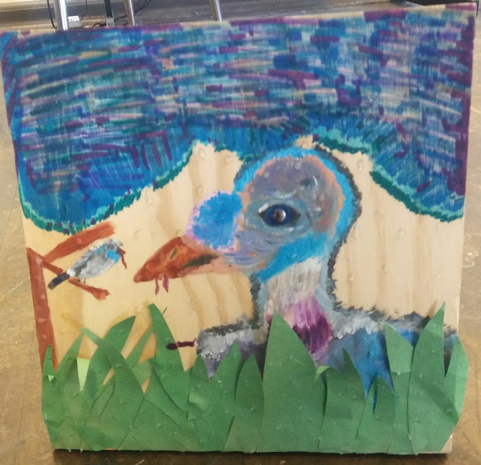
My art relates to the world I live in because people today to alot for other people. It shows giving and doing what’s good for people you love, it gives/show's purpose. This art pieces relates to me because I give to everyone and anyone. I am a giving person. My piece could impact the world because it could be used as do as your parents/ someone who loved you did for you. Give and you will be given to. Patience is key in doing any art work. And just doing and and see where it takes you. With mines I just started drawing and a bird came. With painting i just grabbed colors and that is how my art came out the way it did. You just have to not think about it and just do it. I think that, that is where the best work comes from.
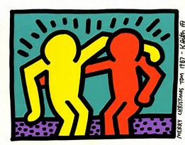
In contemporary art my work fits with an former artist named Keith Haring who is no longer alive. I believe that my art piece fits with his, iIt gives off the feeling of letting people think what they want about it/ people having their own perception of what they think your art piece means. My art piece is pretty obvious that there are two birds and the bigger bird is feeding the little one but that can mean anything. Keith’s art is with two stick figure people in a room with lines above their heads which could mean they are at a party or they are trying to help each other out. There are so many other ways you could see that art as.
Doing this piece I was not inspired by any other work.
In conclusion, I am very proud of my artwork. I feel that mixed media art has pulled a more artistic side from me, taught me that art is not always planned, it will never ever come out how you want it to. Overall I like that a lot of people will look at my work and think of different things like the meaning and why I did certain things the way I did them.
Citation(s):
Haring , Keith. "Keith Haring | Pop Shop 1 (Best Buddies) (1987) | Available for Sale | Artsy." Artsy - Discover, Research, and Collect the World's Best Art Online. N.p., 1987. Web. 29 Mar. 2017. <https://www.artsy.net/artwork/keith-haring-pop-shop-1-best-buddies>.
Spanish project
Society's True Face
I’ve created this masterpiece because I feel ad though it has a great meaning to society. It also brings a food for thought type of message . While working on this project I realized I have achieved my goal in creating a visual representation. For the message that I have been trying to convey to society. When you see a trash can there are multiple things that come to mind. In an artist's perspective it could mean throwing away inner struggles. Or keeping things inside or to talk about that bad things about something or someone. Although that’s not what I have intended for the viewer to think about. Making this 3d sculpture I have achieved my goal in making an actual representation of society. This project has no correlation to my previous work or to any other piece of art that i’ve made. I first made a drawing of what I wanted my 3d sculpture to look like then i made a rough draft of my work with clay. Then I made a Final draft more improved with more detail and it’s colored. The whole base of making this piece of art was to represent the world I live in. Trash, complete and utter trash. The actual sculpture is empty and has no real trash in it. You can simply imagine the metaphorical cans and wrappers that represent what’s wrong with society. A lot of our society is bad but there is always a little bit of grey in the middle. My grandfather was shot and killed in cold blood and no murderer was found to be given a trial. He received no justice. My art gives people something to think about. Think about themselves, think about the way society is structured, think about their own happiness. Having a certain technique can bring out a different feeling in your art. I added sharp detail and edges to create a deeper feeling for my 3d model. I learned how to make a functional 3d sculpture.
Anna's Art Work
I created my art piece because I wanted to try to put my feelings into my art. That is why I decided to draw a heart and make it to look a little scattered. My overall vision was to understand the making of the limited palette painting. What I would like to communicate to the viewers is that there is some confusion in my heart. I feel like I achieved a few things while creating this work. I was able to show people how I feel. Compared to my previous work I honestly feel like my artwork was a lot better this time around because I put more time into it. If I had to pick an artist that my work fits in with i would say that it fits in with Sam Francis because he did a little bit of splatter painting.
As I started my work I first looked up how to draw a heart with spirals in it. After that I drew it out in my art notebook and transferred it to the piece of wood. I then made the colors I wanted to use and put it on the heart that was in my notebook. After that I painted the heart and used the splatter technique. My work shows that I am lost and all over the place but even with that I am still moving on. When I started to talk to my mom again I didn’t know how to feel I felt lost with no direction. I feel like my work can show many young adults that they can do anything even if they aren’t good at it. When making the painting the technique was important I strategically chose not to have the spirals in a specific place, I had them all over the place to show that I was feeling scattered. I was excited to learn how to do the splatter paint. I watched a lot of YouTube videos so that I could see what other people did while using the splatter paint technique.
In conclusion, I really enjoyed learning all of the different techniques and learning how to make various colors using 3 paints as a base. Additionally, I enjoyed getting to express how I was feeling via my art. It made me feel extra connected to my mother who I hadn’t seen in a long time.It Flows
I created this piece of work for my girlfriend. Her favorite color is blue so I figured since I did the rest of my work for people special to me I should make one for her too. She loves it. My work actually came out way better than I suspected it to. I did it a little sloppy but a messy artist is a dedicated one! I wanted to have that galaxy effect at first but I felt like that was a little to complicated for me to do in such a short amount of time so I had just decided to go with a wavy kind of flowy background.
I think it says “water” or “ocean”. It’s such a pretty blue it might even make you a little nostalgic. Looking at it for a long period of time will allow you to see how the paint flows into each other, you may just be able to identify the technique I used to achieve that flow. I think I achieved another level of experience when working with these paints and techniques. It’s very different from what I’ve done in the past which is what my goal was, to do something different.
There's a painting by David Munroe called “fade Into You”
. His painting is similar to mine when it comes to the style of having two or more colors fading into one another without lines.
First I chose 3 colors; blue, white and black. I used those colors to create a mixing guide that would allow me to make several colors out of the 3. After doing that I was able to save the colors I made. I initially chose three other colors that was made from the mixing guide, I don't want to spoil them so I won't say which ones but when starting my work I took heed to the kind of brushes that i decided to use and started from there. Using a lighter color mix at the top and a more darker one at the bottom.
It doesn’t have that kind of impact on my life. It’s just something that was fun to do, you know? I can say that I’ve created a painting like that and am able to show it to my friends and family. I personally don’t believe that it will have any kind of impact or could for that matter.
For the painting that I’ve created you need to have a medium sized brush and have a straight hand. The curves are very noticeable so you must try your best to keep your lines straight. You don't want you brush to be too wet because then your paint will have been too watery and wet and would require you to apply more than one coat to have your painting bold with the color of your choice. For this painting i chose to go horizontally rather than vertical so it will look like it would go on forever if it could. Like I have always said, I compromise every time I do a new piece. I come up with an idea of how i want it to look and then I shoot.
Overall as you can see the work I produce is a reflection of my thought process when it comes to doing new creative things. I'm a risk taker, i feel as though when I think too hard it doesn't come out the way I picture it in my head.
Butterfly_K.B
I created this project because I wanted to try something new and I wanted to challenge myself.
My overall vision for the work was to precisely excel a limited palette painting. I wanted my
audience to figure out that I was doing a limited palette painting by looking at my painting. I
think I achieved my goal which was to do a great job of portraying a limited palette art piece. My
current work relates to my previous work because in all my art work i tried to challenge myself
by trying something new. My process of this artwork was first I drew a sketch of my art work.
Then I picked out my colors. Next I mixed up my colors then colored. Then I put my artwork on a
canvas then painted it. A new technique I used is mixing colors. I never mixed colors in any of
my other artwork.
Q3 Tech project
My project goal was just to show that the NFL comissioner Roger Goodell and NBA commissioner Adam Silverare not liked just as Donald Trump is. My process was just to go through the internet find the pictures i needed then i took the face of Roger Goodell and put it on Adam Silver then put Trump's hair on to of that. I ended up find out how to face swap, cut & switch images and how to re size. Well if i could do this over i would make a more meaningful image probably about racial injustice or Trumps injustice against different culture and ethnicities. The the only thing Pixlar(the tool) did was it kept deleting my image after i was done with it. But I now think if i ever wanted to make picture art for something like a YouTube chanel, a project, or anything of that form.
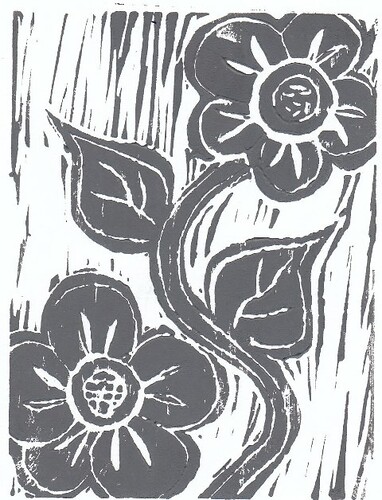
Jadas Linoleum Rose
I worked/created the linoleum project because it looked the most interesting to me. Watching one of my peers work on it from first quarter, it made me want to do. It seemed like a challenge and required a lot of different tools. Working on this project, I was hoping to achieve the idea I had in my head for what I wanted this to look like. I wanted to achieve a clean cut, black rose. I want my work to communicate to the viewer as beauty when it is first seen. Previous work relates to my linoleum by the time I took to create this project and the time I put into it. My process was simple and short for this project. I started off with my sketch of my linoleum which was a small rose. After the sketch, I transferred it onto the rubber and iron & carved it until I thought it was best. Painting applied to the rubber and a blank white piece of paper was made. My project wasn´t the best and not the neatest but I want people who view it, to get the message that its ok if its not perfect because its art and art is whatever you think is beautiful to you. Carving my linoleum was an important technique because it took patient and time to get it out the way you want to. Carving was one of the newest techniques I learned doing this project and the one I enjoyed the most.
Overall, my linoleum project is important to me and I worked hard on it. The techniques I used were different which taught me something new and I plan to use them in my next art projects in the future.
Flower
I created this artwork because I wanted to work with materials that I never worked with before. My overall vision for my work was to artwork an artwork that was different and unique. I think my artwork communicates a positive and happy feeling. I think I achieved a positive feeling through this creation of this work. My current work relates to a previous artwork that I did in middle school with paint. My art work fits in with still life contemporary art. My artwork is very similar to a painting by Marc Dalessio named Two Roses. During the process of creating this artwork, the process of creating this went very fast. With already knowing what kind of design I wanted to do. Carving on the linoleum palate only took two days. I struggle with making a print with figuring out the perfect amount of paint to use. My inspiration for my image came from https://c1.staticflickr.com/3/2434/4048317339_24c1be827d.jpg . My artwork reflects my own life because I live an happy and positive lifestyle. My artwork can influence and make an impact on the world because it creates an happy feeling. During this process the technique that was most important for creating my artwork was the way I held the carving tool. I used three different carving tools which were all used for different things. The smaller carving tools were used to make finer lines throughout my artwork. A new technique that I learned with this process is that you do not need to use a lot of pressure to curve out the linoleum palate.
Overall, I enjoyed making this artwork. I just wish the process didn't go as fast as it did. I had fun using materials that I never worked with before. I hope that I am able to work with carving tools again.
Sunsational
I have chose to create this piece using limited painting because I really wanted to calmly paint. I feel like painting was the most soothing and the best fit for me, so I chose to do something along the lines of paint. My overall vision for this work was to have sort of like an ombre feel. I used two bright colors and then black because that color is bold and I feel like it really would have made each color stand out on its own. My work communicates calmness. My work does not look like it was too hard to make and you can see the brush lines as well so when I look at it I think of just sitting there and calmly moving my brush along the paper. I think the communication can still be interpreted differently. I achieved the image that I want which was to just have a painting with blended colors and to have a painting where I made colors only using certain colors. This work relates to my last work on the same level that my last work I used colors to really pop and catch the viewer’s eye sight immediately. Well the same applies here. This piece catches viewer’s eye because of the bold colors and how well they pop. Leo Gabin, for example in his Belgian pieces is the exact same method that came to mind in the midst of brainstorming. All of his pieces use bold and colors that pop which is very contemporary because now a days kids are using and wearing all types of bright colors because that is what is in style.
My process for this piece was to complete what I can each day in the given amount of class time we had. I started with the solid black color first since there was no mixing involved using that and then on to the solid yellow since there was no mixing as well. After that was complete was when I moved on to the background because the leftover space which is the background is where the mixing of colors came into place. I mixed the colors on a palette first and then applied it to the brush and then the canvas. There really was no inspirations behind doing this. I just thought of nature and kept going. I just wanted to capture a sunset look and apply a tree. I thought about adding flowers, but I did not think they would fit as nicely. As stated before my image just reflects the world because of the bright colors that are in trend today. I would say that the world and my life is not as peaceful and beautiful as my painting is. To explain that you would have to use a lot more darker colors. My work can impact the world as a goal or to send out a message to make the world calmer or more peaceful. My image can be a representation of somewhere tropical or paradise so, this can give people the inspiration to want to calm and settle down to be able to either view their own world this nicely or to be able to travel somewhere this nicely. Lastly, a really nice technique to use when painting with limited colors is to really make sure you mix your colors well and apply enough color that you needed. I realized sometimes that I would pick up more of a certain color because it was not all that blended. However, a new technique I learned would probably have to be with the background to start painting from top to bottom to capture the colors fading in better instead of corner to corner or section by section. This way the colors really could have been blended better and so you can really distinguish the difference between the different mixed colors.
Electric Flower
Electric Flower” artist statement :
During this project I knew I wanted my work to be bright, to tell a story without including words.
I purposely had many things going on with my creation because I didn't want the viewer to just focus on one thing but everything at once. Doing this project, I achieved how to add line,texture and drawing into one picture. My current work relates to past work more in a better way because I improved, I stayed more focused on having a neat project and making sure my work was meeting the expectations. I simply was just going to have the colorful flower picture but I wanted to go outside the box and add a dramatic background including texture with the bold dots I created. I also did not want my work to be dull so I used multiple colored markers to incorporate my theme of the " Electric Flower”. This project does not affect the world I live in but It does reflect who I am as a person.. Bright, variety of, out of order but put together at the same time. Its unique in its own way. Lastly a new technique I learned to do is to create my own frame for a picture by just using a ruler, scissors and some tape. This project has helped me express myself through colors, lines, texture and drawings.
Mine Turtle
I decided to make a project in the 3D sculpture category because it’s a medium that I’ve never really tried out before and I wanted to broaden my horizons. This particular piece was me wanting to make a character from a web series I watch named mine turtle. I think it mainly shows that when you make art it doesn't have to be perfect but it must have meaning. I think the main thing I took away from this is how to work with aluminum safely and well. This specific piece is like nothing I’ve done before, I have always been a fan of painting so sculpting was a big step away from that. I was trying to make it like the figures of vehicles made from soda cans that have been really popular lately. I made this by cutting up pieces of aluminum seltzer cans and hot glueing them to each other, while it was difficult it worked well with a little extra effort. This piece isn’t really meant to make anyone feel any specific feeling just to let them see a fun little project that I had fun making. Overall it was a fun project that was somewhat difficult but ended up nicer than I thought it would.
Q3 Final Project: Mixed Media; Sprig of Rue
I created the work because my religion is centered around it. The branches are the stem and roots of issues and sins. The Key was represented by unlocking the truth of meaning. The flower represents the nature beneath your feet and the nature of the issues. The Moon represents the reflection and how you look at yourself based on the issue.
My work communicates confusion and probably the eyes beyond perception. I think I will achieve the design and trying to express what I mean by the use of colors and certain materials that will resemble these objects. My current work relates to my previous work is that it was very messy but I ended up getting the job done also there is always some form of mysticism within my work.
My work fits in with the art of construction in which we put different things together and make something new. My work reflect the world I live in because this art piece is made of different material meaning that not everyone is similar also the piece is kind of beyond recognition which is kind of how life is, there’s no recognition within life.
I am not sure how my work can influence, I guess it will help people understand the mindset of others and have them curious. A certain technique would be pace yourself follow your checkpoints and keep yourself posted on what you are suppose to do. I feel like it is very important that every single color has a purpose and looks right. Always pay attention to what colors you are using and using it as a tool.
Contemporary Art Piece
http://www.australiacouncil.gov.au/strategies-and-frameworks/asia-pacific-triennial-of-contemporary-art-apt8/
On this website the first art piece I see is called "muted expression" by Tsherin Sherpa. My art piece fit in this range because it is a confusing concept but only the artist really knows what the real meaning is. I also feel like this art piece to me expresses culture. For some very odd reason it reminds me of Hinduism because of the many different colored arms and the symbols that the hands are doing. My art piece can relate because the art piece I did follows Roman culture because the Sprig of Rue is an Italian cultural reference.
Art Elective Project
I decided to do a mix media project because I wanted to try something different. I never painted anything before so I stepped out of my comfort zone and tried that. My piece was a bird flying over a sunset from the view over an ocean. I specifically chose the sunset over the ocean because that is one of my favourite sites to see and the bird should be representing free roaming to me, but people can make their own interpretations.
After doing this project I can say I learned a lot about painting and blending colors etc. This was a challenge for me because it was my first time but I felt like I managed it fairly. What I did was, I first made a sketch then I started painting, and at the end I added the cotton for the clouds and the feathers for the bird and I also used sharpies to color the bird in.
I feel very accomplished about this project, because I had an idea and I visualized it. I would like for people to see this and not think the way I think but think of it in their own way.
Love & Hate
I chose this project because it seemed the easiest to do. My overall vision wasn't the love and hate with the arms. I first started off drawing jhene aiko but it became too hard. Then towards the end of the project I decided to change up vision. I wanted to get deep and personal with my drawing. I've been going through a lot right now and the words love and hate both describe how I feel. The hands are reaching out for help. My current work relates to my past work because all I did/do is draw things that represent me. My work reflects the world I live in because many teenagers dealing with a possibility of their parents getting a divorce are conflicted with very different emotions and I think the best words are love and hate.
Quarter 3 Project
Maliya Edwards
Art 2
My Artist Statement
The reason I did this project because I really like painting and i thought it would be interesting to do this project. It was fun to mix the acrylic paint to see what the colors make. The design i created for this project was a sea shell. A sea shell with a sea like background was my original vision for this project. My sea shell came out the way i wanted it to be the only thing that didn't come out so good was the coloring i choosed for the seashell. The three colors I decided to use for this project is dark blue which I had mixed with an acrylic black. I used a yellow orange color that made a light orange color that was the color I used for the seashell, and it was another darkish color I mixed with the blue to add into the background just to darken it.
What my work communicates is a sea shell with a dark blue background. It would make the viewer think of the beach because that's where you would find a lot of sea shells. I think what I achieved best through the creation is i made it look like the design i wanted to look like. I also achieved mixing my colors very well and picking out my colors good. This relates to my last art work because every time I do an art piece I challenge myself to something new.
The process I went through to create this project was simple steps. First I had to figure out what I wanted my design to be for my panting. Next i had to decide the 3 colors I wanted to use and rather i wanted to be regular or acrylic paint. Then I had to sketch my project, after i was finished sketching my project I then used some kind of printing paper to transfer that design onto a canvas. After that step I then mixed made a color graph that showed me what colors to mix and what the colors came out as. Once I was finished that I then made the 3 colors that I needed for this project and started to paint my design. Here is the link I got my design from in case anyone was interesting. https://www.google.com/search?q=seashell&rlz=1CADEAA_enUS713US714&espv=2&source=lnms&tbm=isch&sa=X&ved=0ahUKEwil0dP05PfSAhUC1mMKHfgFBTcQ_AUIBigB&biw=1366&bih=654#tbm=isch&q=easy+seashell+drawing &*&imgrc=puILndU1yw-yRM:
My artwork is a reflection of life because looking at this picture I think it would remind a lot of people of the beach. The beach is known as a happy place and where a lot of people have a good time at and it is considered as relaxation. It’s very important to keep a certain technique because if you don't or do something wrong that is not apart of the process it could mess the project. That's why it is very important to follow all steps of the project and it teaches us along the way how to follow steps in life to be careful and take our time.

Q3 Linoleum Print
I always wanted to print my own really cool design. Honestly, I never thought past that so the design was not thought of until I sat down to do my sketch. This piece in particular is a result of my mind wandering. I could not think of a topic, so I thought “what if I base my work around my thinking.” This is why the work outside of the creature thinking is very abstract: half of the time when I’m thinking I may not be thinking of anything at all, I’m really just zoned out and really heavy into my mind at the moment. I wanted to portray this in my print and I feel as though that went well. I believe it even conveys that exact theme perfectly as my peer reviewer saw my work and instantly thought “Is the title ‘Imagining’ or something like that?”
Although I am mostly proud of my final product, the process was very frustrating. After two days of working to cut my channels, I found that they were nowhere near thick enough to print as I wanted them to. This meant that I had to do a lot more work and really had to focus on honing the skills involved in this. Channeling IS SO CRUCIAL to printmaking, without it everything else is futile. Just being able to finally produce an acceptable print is an accomplishment I am proud of and the finished piece really fits into my collection of work. I usually do abstract art so this is no exception, however it is a different art style than I am used to which makes it unique.
A while ago I met an artist named Antonio (you can find some of his work here https://twitter.com/SantosTheArtist/media) whose style reminds me of what I aim to create. His surreal style is my mind’s first example of abstract when I think of the term as it applies to art. He uses realistic figures with very strange backgrounds and designs which I tend to do as well.
My work reflects me because I really like to see the underlying message and convey it to people but I feel it is best when it is not done straightforward. This is why I believe we enjoy songs that compare a theme to an object so much: you can tell us what love (or whatever) is using direct language but comparing love to a warship or battlefield just seems more interesting and overall insightful, this makes the enjoyability rise in my opinion. Through abstract art I am always reminded that maybe the truth lies somewhere we have not seen before or in something we have not seen before.Black Power
I created this project because I wanted . My overall vision for the work was to draw a
picture of a black girl with a puff and a crown with details as in depth as in the picture without
the color. I wanted to bring out the beauty through value and lines which was used to represent
her facial structure and contour.I think that my art communicates that black is beautiful can be
represented in many ways.I think i achieved personal happiness in getting to represent who i
am in the way that i am a black female. My current work relates to my past work because
usually when i create an art project it relates to things that affect my life or things that have been
inspiring in my life.
I would say my work fit in with todays look on black people and black history month . I
think i could relate my artwork to Kehinde Wiley because his art represent black empowerment and black lives matter.I first started my art piece by creating
many sketches of what I wanted to draw. Once I got the idea of how I wanted to draw I then got
my utensils and started my work. I started first by drawing her outline features. Then, I started
on her features. Once I got her features down packed I finished by carving of her facial
structure. The image that I was trying to describe was a picture of a black girl with a crown . My
work reflects the world I live in because people always have something to say about black
history month. The technique that I think was most important was how precise I cut the linoleum
because it really brought out the features of the drawing. A new technique I used was using a
paintbrush to cover the parts that were blan
King
I created this work because I saw my peers do it and it looked cool too me. I was hoping to make a cool basketball design. I feel like it communicates my passion for the sport through art. I achieved a new way to create art in a new way so of I want to show someone else hot too create what I did I can show them with ease. My current work relates to my previous because they both relate to basketball. In this work I drew a ball and a crown. Then my last work I drew Stephen Curry’s sneaker. My art work can compare to graphic designers that do basketball art.
I made my art by finding ouy the design that I wanted to make. Next I traced my design on a piece of paper. Then I got blue paper and the pad that you cut on. After that I put the white paper over the blue paper then I put the blue paper over the pad. Then I re traced the design on the pad with the blue paper. Then after that I began to cut out the design that I drew but heating up the pad with the iron. My work reflects my life as a basketball player. It can inspire more people too make basketball art. Of you don’t do a specific part of the tenique right you wil mess up the complete design. I learned how too carve designs into a pad. In conclusion I learned how to show my apssion using a new form of art