Tower Garden Photo Journal

Doing this project opened my eyes to different types of gardening. I wasn't aware that there were different types of gardening methods other than traditional gardening until now. Using a tower garden is environmentally just and it helps tackle the issue of food insecurity. People who live in environments where they may not have the resources to get food could start growing their own food. Based on the ted talks we watched in class gardening has had many benefits for people all over. Tower gardens can also help solve the problem of  growing in harsh weather. 

Stats Research Paper

Errion Holness

Statistics

Research Paper

Ms. I


Does the life expectancy of a Chilean man depend on how many children his wife may have?


As tragedy ends, men live longer. Tragic events in a country will lower the amount of children. When people begin to  discriminate less, fight less, and unify together, they live longer. I looked at and researched 1 country using the internet and a Gapminder graph. But, does this all tie in together. I’m going to explain some vital points in each data point.

I’m focusing on the South American country of Chile. The color green represents the South American continent. The graph is on a linear scale with the y axis as the life expectancy of a male and the x axis is the amount of babies per woman. The x decreases as the y increases. There is a negative correlation while the graph is on a linear scale. The Gapminder data is from the United Nations and the World Population Prospects. The bubbles are based on the population size. As the graph moves, it begins with a sharp left turn after 10 years and proceed up the Y - axis. At this time, the amount of children women are having is decreasing over time.


Chile was trying to transition into a democracy. In the late 80s through early 90s, they were trying desperately to become a united country. According to Freedomhouse.org, the people peacefully held protests, created unions and political parties. This led to a steady increase in Chilean male lives. Although, women were having less children due to many factors such as them not being respected as much as men or a growing obesity rate.


An article by the World Heart Federation (WHF) claimed that, “In Chile, a survey showed that obesity rose from 6 % to 11% in men and from 14% to 24% in women in just 4 years.” It also went on to connect obesity in Latin American women leading to dangerous cardiovascular diseases along with other risk factors of smoking and hypertension. The WHF also pointed out cardiovascular diseases as the leading cause of death in Latin America. Therefore, women die after being subject to these dangers. Although, the article also pointed out and said, “As we have mentioned above, this increase in obesity levels affect women more than men. Indeed, they tend to sacrifice their health for that of their family, surviving on unhealthy foods while trying to feed their families with better ones.”


According to some 2012-13 Gallup polls, 32% of Chilean women are likely to say they’re treated with respect. 60% of Chilean women answered no when asked if “they believe that women in their country were treated with respect and dignity” 61% of latin americans overall claimed that women aren’t treated with respect and dignity.  This may have been a contributing factor to Chilean female obesity because an article by Drexel University hinted at signs of a Compulsive Eating disorder. It said that “They frequently suffer from low self-esteem and depression, hoping food will fill the void, or at least help them escape from feelings of stress, anxiety and anger. Compulsive Eating involves addictive behavior with food.”


In conclusion, I don’t think the life expectancy of a man relates to the amount of children his wife may have. I Although, countries will have their major events, it affects the population as a whole and nothing partially. It’s very difficult to separate the country's event problems from the whole population into gender specific categories. My question was sort of broad because of the extensive data I’d need in regards to fertility rates, male careers, and more.


Video Link: https://www.wevideo.com/view/843714453


https://freedomhouse.org/sites//files/inline_images/Chile.pdf

http://drexel.edu/counselingandhealth/resources/students/body-image/

http://www.imf.org/external/pubs/ft/fandd/2000/03/aninat.htm

www.world-heart-federation.org/fileadmin/user_upload/documents/Advocacy/Resources/Region_and_country-resources/Obesity%20and%20children%20obesity%20in%20Latin%20America.doc

http://www.gallup.com/poll/178427/respect-dignity-women-lacking-latin-america.aspx


How The Numbers of Babies Affect A Women's Yearly Income

Maliya Edwards


1/16/17


Ms.I


Benchmark


You ever wonder what could affect the amount of money you make in a year? You ever wonder why you make the amount of money you do and what's stopping you from making more? There are many answers and variables that affect your annual money a year. Today we are focusing on the amount of children and the amount of people in a family effect has on the amount of money made each year. All which support the idea of the less amount of family members and children can lead you to make more money.

In the early 1800s, Ghana were having nearly 7 kids per woman. The family size was an average of 9. In the 1800s Ghana average 696 a year. Now back in the 1800s there weren't a lot of jobs and there wasn't a lot of good paying jobs. Seen below As we get further into the future, in the 1900s Ghana average family size was 8 and the average amount of children were 6. At this time the average amount of money made a year was 725. During the 1800s Ghana were going through diseases. It lowered the amount of the population. It may not show in the average size family but a lot of people died due to diseases. As we get into the 2000s, Ghana average family size went down to 6 per family and roughly about 4 to 5 children a family. At this time people in Ghana were making up to 2,270 a year. Seen belowAs better jobs and vaccines came out for these diseases. As we go into the year 2015, the average family size went down to 5 and the average children per woman went down to 3 roughly 4 kids and average an amount of 4,100 a year. From the 1800s Ghana family size was 9 and average children in the family were 7, now in 2015 the average family size is 5 and children within the family is 3. Seen below

The next country we are looking at is Keyna. In the 1800s Kenya family size was 9 and average children to a family was 7. Again around this time there wasn't a lot of jobs anywhere let alone jobs that paid a good amount of money. People in kenya in the 1800s made roughly 854 a year. Seen below Compared to ghana the family and children size were about the same, although Kenya made more money a year than Ghana. As we get closer to the 1900s Kenya was another country to deal with diseases and deaths throughout the years. In 1900s Kenya family size was still roughly around 9 and children per family was still hovering around 7. The money per year did go up to 1,170 a year. At this time people in Kenya were all at work. Kids started work a very early age to support their families. As deaths started to go up, more education and better jobs were being built. In the 2000s Kenya family size was down to 7 and babies per woman down to 5. The average salary a year has also gone up to 2,140 as seen below Kenya economy started to get better and were offering better paying jobs to the people. Seen below In 2015 Kenya family size went down to 6 per family and 4 children per woman. They were also making 2,900 a year as seen below As the year went on Kenya people had less children and were making more money.

As we move along we take a look at the United States. In the 1800s there was 7 children to a family and average family size was 9. United States was making 2,130 a year. Seen below As we get to the 1900s, we know United States was going through slavery and wars. This made the country lose a lot of people to death and there wasn't many jobs. Most jobs were war or being a slave. In the 1900s the United States the family size plumbed down to the size of 5 to a family and roughly 4 kids to a woman. United states also made 6,820 a year. That was a big jump from 1800 to 1900. As we get closer to the 2000s, United States have gotten their freedom, have rebuild and structure the country and got better jobs. The family size went down again to 4 a family and 2 children to a woman in 2000s. They also made roughly 46,000 a year. Seen below In 2015 the family size and children to a woman and still the same but with the country advancing in technology it made nearly 53,400 a year. Seen below United States has and still known for the richest country in the world.

The last country we are going to look at is China. To start off China made 985 a year with a family size of 7 and children size a 5 in 1800s. Seen below In the 1900s diseases also spread through China wiped out most of its country. China family and children size were still the same trying to refill its population again. They made 894 a year, less than what they made in the 1800s. In 2000s China made roughly 3,680 a year. The children to a woa went down to 2 and family size to 4. The family size dropped very big because China passed a law saying women couldn't have more than 2 babies. Seen below As we get to 2015 the average family size was 3 and the average kid to a woman was a 1 and they also made up to 13,400 a year seen below.

While doing this paper I realize the more kids people had the less time they spent working which mean the less money they made a year. With children you have to spend so much time taking care of them while they are young which meant you couldn't always go to work. In a lot of cases, people in these countries lost their jobs when they had a big family because they miss work too much. All in all, i do believe the less children you have the more money you will make.


The Sources I used was from the YouTube video from class https://youtu.be/N-x7eHuUhNM and  https://www.google.com/amp/nypost.com/2016/01/03/how-chinas-pregnancy-police-brutally-enforced-the-one-child-policy/amp/


Environmental Science PSA

The video doesn't truly represent the goals or the information I learned through researching for this project. Between lack of of the members of my group giving our all including myself and lack of certain supplies the goal I had originally set for my group and I, resulted in our video being highly underwhelming. I felt as though that my group did not really give out much leadership effort, leaving me to do most of the planning. I wish we could have gotten more time to work on the project. The most meaningful part of this project was being able to take national research and citywide research and apply it to my every day life and see food waste happening literally all around me.  

Statistics TED Talk

Suicide is a big epidemic that our country and other developing countries around the world are experiencing. Suicide affects a lot of other factors that are looked at pertaining to the citizens of these countries and their health. Suicide of course is taking your own life but it is considered a disease. You would think this disease would affect life expectancy more. It happens a lot and there is medication to help but this decision is still in everyone’s own hands so you may not be able to prevents this that often. When more people commit suicide in a certain place, the life expectancy rate will go down in that place. Although you would expect suicide would affect life expectancy more drastically,  I have learned from further research and graphs that it doesn't affect it as much as expected.

From further research I have learned that the suicide rate doesn’t affect life expectancy as drastically as I expected. The graphs that I found based on this information show that suicide affects life expectancy but not as much as expected in most countries. Three countries that I focused on for this information is Russia, India, and the U.S. One of the graphs that I found that focused on this data was focused on these three countries. On these graphs it shows how the rate of suicide per 100,000 people and the life expectancy rate changes over time in these countries. For the U.S. the suicide rate and life expectancy moves back and forth but it doesn’t change much over time. The suicide rate is low and the life expectancy rate is high as expected. For India the life expectancy rate and suicide rate barely changes over the years. The suicide rate in India is high than the U.S. and the life expectancy is lower but compared to each other it still is as much as expected. For Russia, both the suicide rate and life expectancy rates fluctuates but not how you would expect it to. The life expectancy rate of Russia moves but not much compared to the suicide rate over time. On the graph the suicide rate rises and lowers between 20-40 suicides per 100,000 people but the life expectancy rate stays between 60-70. You would think that the life expectancy rate and suicide rate may move and affect each other together but the graph shows otherwise.

The other graph that I found compared the life expectancy rate and suicide rate per 100,00 people but not over time. This graph shows all of the countries from 2005 that have data to be presented for these categories. You can’t see the change over the time but you do see that some countries have high suicide rates and still have high life expectancy rates. Also some countries have a low suicide rate and low life expectancy rate. This is kind of the opposite of how I expected the data would be found. Because there are countries whose data shows this pattern you would expect there to be something else in these other countries affecting the life expectancy more than the suicide rates.

One of the reasons that could be affecting the life expectancy in these countries is the age in which people are committing suicide. In some countries that have a high suicide rate and life expectancy the people who are committing suicide there are more than likely to be committing suicide at an older age. The age which people kill themselves affects the life expectancy rate more than expected. If people are living longer in a certain country but as they get older they start to commit suicide the life expectancy rate will still be high because they are living to an older age. In the countries that have a low suicide rate and low life expectancy rate there could be other things in the country that just isn't safe for the citizens. They could be dying from war, because there are other major diseases in that area, etc. The suicide rate of that country will still affect the life expectancy but there are other factors that affect it more.

As far as the suicide rates and life expectancy rates of countries I don’t think anything will change. I feel that they will still affect each other how they already have and there isn’t much we can do about that, Another thing we could take into considerations is that this data is almost 12 years old, so there may be some changes that could have happened but they have not been documented yet.

Understanding the contribution of suicide to life expectancy in South Korea.
https://splice.gopro.com/v?id=VvbYxX

Benchmark TED Talk

https://www.useloom.com/share/9a43d3c0e82111e69309454fac1abeab

How does long term unemployment affect how long the life expectancy of me in that country? I will be making scatter plot graph to help support on my question. Long term  unemployment is the explanatory variable. This question is worth researching because it tell the percentage of men who live longer or shorter due to unemployment. Finding out whether or not long term unemployment of a man can affect their health and sometime cause them to live a shorter life.

Starting off my research I want to give the overall long term unemployment rate and the life expectancy rate of both women and men together and separately. The countries that I picked for my research were the United States, France and Japan. Not really having a particular reason for why I choose these countries to find data on but it will be interesting seeing other countries economy problems. Wanting to compare data from a overall view on long term unemployment to see if, unemployment affect the life expectancy both men and women together or just men. Below is three graphs that will show long term unemployment vs. life expectancy for men and women and both men and women together.             Screenshot 2017-01-18 at 12.21.00 PM.pngScreenshot 2017-01-18 at 12.29.05 PM.pngScreenshot 2016-12-16 at 9.13.01 AM.png


When looking at these graphs, I notice that with women unemployment for them is low in the United States and Japan and for those who are unemployed still life longer than the average long term unemployed for a male.

When thinking about a topic to research, I thought about something that I think that mainly affected the United States. This topic was Male Life expectancy based on Male long term unemployment rate. So what is the average age a man lives too based on their long term unemployment. What I found when researching is that men with long term unemployment tend to live to about 70 to 75 years of age.  When the long term unemployment rate of goes up (which is the y axis), the life expectancy of a male (which is the x axis) will be shorter. These fact are based off the three countries I picked United States, Japan, and France. According to Business Insider.com, “it's a fact that unemployment can lead to a loss of a sense of purpose and disconnection from the world — and other research shows that social isolation, and loss of purpose, has real health implications.”

Graph of Male Long Term Unemployment and the Male Life Expectancy from not having a job for a long time.

Screenshot 2017-01-17 at 6.39.11 PM.png

Screenshot 2017-01-17 at 6.39.41 PM.png

Screenshot 2016-12-16 at 9.13.01 AM.png


The x axis is represented by male life expectancy and y axis represented with long term male unemployment.The dots on the graph stands for three different countries United States (Green), Japan (Red), France (Yellow). The most important observation on my graph is that most long term unemployed men in these countries live a life to about 70 to 75 years of age. Something else that I noticed is that countries like the United States and France every time the long term unemployment goes up, the life expectancy of a man life is lowered from the average 70- 78 just to 70 years of age. Another observation that I noticed is that the bigger the dot the larger the population of men on long term unemployment and the country life expectancy of a male. The smaller size dot are has less of the male population that are being affected by long term male unemployment and life expectancy.

Thing that I noticed was that the dot are are going more in a positive correlation which in life expectancy is a good thing but not as good for the unemployment.  Also that in the years of 1983 in the United States, France 1998 and, Japan 2003 in these years male unemployment has risen up which cause the life expectancy of a male to be lower than average. This observation leaves me as questions like, “What was the cause for the unemployment to rise in United States in the year 1980?” According to InvestmentWatch.com, it shows and give the accuracy of male unemployment rate and the reasons for the drop in unemployment in the 1980’s. According to this website

The early 1980s recession was a severe recession in the United States which began in July 1981 and ended in November 1982
Unemployment had risen from 5.1% in January 1974 to a high of 9.0% in May 1975.  Although it had gradually declined to 5.6% by May 1979, unemployment began rising again thereafter. It jumped sharply to 6.9% in April 1980 and to 7.5% in May 1980. Twelve million people were unemployed, , an increase of 4.2 million people since July 1981.  Unemployment rates for every major group reached post-war highs, with men age 20 and over particularly hard hit.

“What was the cause for the unemployment to rise in France in the year 1998?” is another questions that I asked based on the data on the graph. According to tradingeconomics.com, it confirms that the unemployment was drastically high in france 1997 and 1998. Following a chart that show the high rate and unemployment.

It confirms that the unemployment was drastically high in france 1997 and 1998. Unemployment rate in France averaged 9.26 percent from 1996 until 2016
reaching an all time high of 10.70 percent in the first quarter of 1997 and a record low of 7.20 percent in the first quarter of 2008.”

Screenshot 2017-01-03 at 7.06.38 PM.png


In Japan we would also like to know “What was the causes for the unemployment to rise in Japan in the year 2003?”. Based on keidanren.or.jp, it gives information on what going on in Japan in 2003.

According to Tokyo Big Sight,

For many years after the end of the war, Japan's industrial structure was geared toward the task of catching up with the advanced countries of the West. According to nber.org

“In the second half of the 1990s, the job insecurities of middle-aged and older workers have received much attention. The Japanese government, media, labor unions, and even employers often admit that corporate restructuring measures have resulted in massive job loss among older, especially white-collar, workers.” Also that “middle aged
and older workers, who mainly lost their jobs through bankruptcy,
dismissal, or mandatory retirement.”

Another statistical evidence graphs that I will you reference in this paragraph along with some in text citation from whitehouse.gov.
Screenshot 2017-01-16 at 9.47.29 PM.png
“As Figure 1 shows, participation among prime-age men peaked in 1954, declined only slightly until the mid-1960s, but then began to decline in earnest in the decade between 1965 and 1975, when the share in the labor force fell from 96.7 percent to 94.2 percent. Since then, participation has fallen persistently, with sharper declines in recessionary periods, such as the early 1990s, that were not fully reversed in the subsequent expansion periods.”

When doing some research I discovered whitehouse.gov, which talked about the United States “during the Great Recession, the rate of labor force participation among prime-age men fell steeply, falling from 91.5 percent in January 2007 to 87.9 percent at its trough in October 2013”
“Not only has labor force participation among prime-age men declined over the past six decades, since 1990, the United States has had the second-largest decrease in prime-age male participation among member countries of the Organisation for Economic Co-operation and Development (OECD). Of the OECD, the United States now ranks 3rd lowest out of 34, as shown in Figure 3—above only Italy and Israel—in terms of prime-age male labor force participation, compared to 10th lowest out of 24 in 1990.”

This supports my thesis statement because it prove that men that have not been employed in a long time, or that been look for a job for a long time, can have an affect on a man or persons health. Unemployment can sometimes leave to serious health conditions or even death.

  • "U.S double digits unemployment rate of 1980-1981 vs. 2008-2009 single digit." InvestmentWatch. IWB, 06 Sept. 2012. Web. 31 Dec. 2016.

  • "France Unemployment Rate | 1996-2017 | Data | Chart | Calendar | Forecast."

  • ""Challenges and Perspectives of the Japanese Economy and Industry"." "Challenges and Perspectives of the Japanese Economy and Industry" (2003-06-02). N.p., n.d. Web. 20 Dec. 2016.

  • Genda, Yuji. ": Labor Markets and Firm Benefit Policies in Japan and the United States." N.p., Jan. 2003. Web. 20 Dec. 2016.

Green Plague Inc.

My group and I started this benchmark by emailing our client (The wonderful Ms. Reed) to find out her needs in reference to a green design in her classroom. We gathered her ideas and our own in our consultations, and sketched out designs. We went through several designs, and took our measurements. When when our we finalized a design, we made our sketch better and went through several more ideas about plants and green effect. Due to some set backs, we have not completed our building part of the project, but as have our design done, and just need to do a quick installation to the frame and of the plants. 

IMG_8843
IMG_8843
IMG_8848
IMG_8848
  1. What is your project about? Describe the process you used to accomplish your goals. Look back at the steps you had to take in your checkpoints. Describe your landscape architecture company and what your clients had asked for. How did you accomplish your goals and meet your clients' desire? Hint: Green Design Research

    1. Our project was about making a green design that would benefit the environment and make a teacher’s classroom more eco friendly by implementing our design into their class. In preparation for this project, we looked up 10 green designs. We wrote about them and considered which one was more accomplishable and easy to do. We had many ideas rough drafts of what we wanted to do, but most of them did not come up in the final product due to the cooperation of the product. Although what we did end up making deal with our client that we talked with, Ms. Reed, and we were able to work fondly from there. Our client simply wanted us to make her room more “plant-ful”. We agreed that we wanted it to be seen, get enough sunlight to live, look appealing, not get in the way of the children in the upper side of the classroom, and take up space that isn’t already used. We accomplished all of these. The last one being partial.


  1. What does a plant need to thrive? Describe how the design of your project took into account the needs of the plant you are planting in your design (i.e. water, nutrition, temperature, safety, amount of sunlight).

    1. A plants needs sunlight at the least sunlight to live. They could also have strive on water, but not all plants need that(even though most plants do). Our design was built on the wall board because it wouldn’t get in the way of the students and and it would be getting direct sunlight from where it is in the room. Our plant also doesn’t need much water or any really, so it wouldn’t be a hassle to water it.


  1. Describe what affects a plant's design based on what you have learned from your past assignments.

    1. What affect a plant's design is is if the plant is getting enough sunlight or any. Would it be easy to water or help grow the plant in the design and or placement. The number of resources given to you, plus the number of plants you have. It’s what you’re given that determines the design.


  1. In what ways are the plant's design and the design of your project similar? Think about what affected the overall design of your project and also the development of plants.

    1. The plant's’ design was built by its cells and organs and things inside of its anatomy. While our design did not ‘build itself’, we put together this design, as the plant does for itself.

  2. After doing the Green Design, how do you perceive the relationship between nature and technology? Why? Remember to define nature and technology in your own terms.

    1. Nature is the natural development of plants (and animals) in an ecosystem, and technology refers to man-made objects that were created for one or more purposes. I perceive that nature and technology in most cases live in a symbiotic relationship, giving and taking from one another. Like in our project, our ‘technology’, or project design will give the plant nutrients and space to grow, while the plants gives us improved space quality and reducing carbon dioxide levels.


  1. Overall, what did your group do well in the project? What could your group improve on?

    1. Something our group did really well was the planning for each of the checkpoints we needed to reach. Every time we had a check point to reach, we made a plan of what to do so that we could reach the requirement just in time before it was due. There might have been times where our original plan didn’t work, but when that happened, we made  another one one the spot and followed that one. Our group could have improved on our options. We had many ideas on what to do for the room, but it turned out that we could really only do one of those ideas. This was because we ran into problems like price, placement, time, and inconvenience. We should have worked on how our ideas work.

Q2 Benchmark Green Design

Ngozi Enwereji

Process: Our project was about making a green design that would benefit the environment and make a teacher’s classroom more eco friendly by implementing our design into their class. In preparation for this project, we looked up 10 green designs. We wrote about them and considered which one was more accomplishable and easy to do. We had many ideas rough drafts of what we wanted to do, but most of them did not come up in the final product due to the cooperation of the product. Although what we did end up making deal with our client that we talked with, Ms. Reed, and we were able to work fondly from there. Our client simply wanted us to make her room more “plant-full”. We agreed that we wanted it to be seen, get enough sunlight to live, look appealing, not get in the way of the children in the upper side of the classroom, and take up space that isn’t already used. We accomplished all of these. The last one being partial.


​https://docs.google.com/a/slabeeber.org/document/d/12WMRdSbGCqjCQUoHAHprzBunaAx_HinNL8mqELemZqc/edit?usp=sharing
IMG_8844
IMG_8844

Botany Quarter 2 Benchmark: Green Top Landscaping

Hello, I am one of the members of Green Top Landscaping, and I am here to tell you about our own green design initiative. Here at Green Top Landscaping I have designed and constructed a desk that serves as a growing space for plants and work space for our client, Ms. Isakowitz. For our client we delivered a green addition to her classroom, that adds a modern touch to the room itself and her work space. Our client wished to have a desk that could both serve as a spacey and efficient work space, since as a teacher she needs it for grading and other such teacher business, and as a lively space to add greenery to her room and her area. So we gave her just that. To finally reach this point it took weeks of careful planning and construction, but there does remain some additions to that the desk. 

To account for the plants need for soil, water, and sunlight there is a space that has been designed to be designated for these specific needs for the plant. Apart of the desks structure there is a box like structure that would serve as the growing station for the plant that our client decides to grow there. The box will have a small irrigation system attachment so that she could use her water bottles to water the plant through out her day and the time she is in possession of the desk. The box also accounts for the plants need for sunlight or artificial sunlight. So there will be a growing light attachment that will serve as the plants energy source. Also the box accounts for the plants need for soil, so there is a base attachment that could serve as a place that our client can put her own soil for the plant if she doesn't wish to use pots or beds for the plants. Noticeably, the box as been decided to be left open so that the plant can exist in an cool to temperate environment that provides airflow to the plant. It has also been left open to account for the many varying plant sizes that exist, giving plants enough space to truly grow while also being an effective use of space for the desk. 
There are many factors that affect how plants grows, develops, and evolves over time. These factors include environment, temperature, available nutrients, amount of light, and outside involvement. Plants leaves can be bigger or smaller to account for available light in their areas, there roots can be shallow and stretch far or be deep and concentrated depending on the available nutrients in the soil and on how often it rains. Plants can have taller stems due to other plants competing for sunlight in their area. In a similar fashion, our desk was developed with similar themes. The desks height was chosen due to its need to be tall enough to serve as a efficient and productive work space for the teacher like a plant needs to be tall as to effectively gain nutrients from the sun. The desk is the size it is due to the need to exist in an relatively small environment among other tables and spaces in the room. These are some examples how plants design is similar to that of our own desk. 
Through out the process of this project, I truly believe that the relationship between nature and technology can be similar to the relationship between siblings. I think they can have a much more integrated relationship. I don't think that there should be any reason to separate the two of them or consider them that different from each other. The natural world, the world that consists of living organisms, sentient beings, and of which our living breathing world belongs to, shouldn't shy itself from that of the more mechanical, more technological world of machinery, of inanimate objects, of tools, or technology. They should be used to work together to learn from each other like an older sibling would teach its younger counter part. Nature and technology can be used to improve our own way of life if we can integrate it more with each other and in our lives. 
Here at Green Top Landscaping, through out our process of completing the contract we had with our client, we had to drop a few members of our group due to their inactivity within our company. So we were left with a pair of members, myself and Errion Holness. It was a partnership that functioned. Overall this arrangement worked much better for the project than it would have with the removed members of our organization. I believe we could improve on our time management and communication. It took me longer to complete the desk than it could have, and there are things that could be improved about it. But for the most part I am satisfied with the design I had created myself and the product that I have constructed. 
Project Progression: 
Beginning to End
07DE3624-7EA7-4895-9042-742F993A03C9
48DB8D56-7B0B-4513-9D95-2A37B04FCBFD
4EAD3EA5-FF52-4AF6-9551-0A5703481066
0266B4E2-9423-427F-AF6D-8A9780A6FEBB
IMG_0079
IMG_0079
IMG_0080
IMG_0080
IMG_0081
IMG_0081
IMG_0097
IMG_0097

Botany Q2 Benchmark Green Design: Peachy Designs

We are Peachy Designs and we work with many people all over to help them be more green in some shape or form. Our most recent client Ms. Fanning located on the second floor next to Mr.Johnson’s office is our wonderful Guidance Counselor and fabulous creative writing teacher. Sh told us that she wanted her room to be more green so we decided to create a garden box and place it in her room.Ms. Fanning will give the plants what it needs to thrive such as water and general care and since her room has a lot of sunlight that will come naturally. Our green design relates to almost all of our previous assignment which teaches us the inner workings of the plant therefore teaching us how to take care of the plant better and create a stable place for the plant to survive. Overall I would say the as a group we did good on the project however and think that since we were so  exciting in creating we did not plan ahead for possible problems of the garden box such as it being knocked over. We do believe that we satisfied our customer and look forward to working with her sometime soon.


Sincerely,

Peachy Designs Cash’e Chapman, Tyrone Grant, & Ali Omer  

IMG_1919
IMG_1919
IMG_1918
IMG_1918

Environmental Science PSA

I chose the topic of food waste because I see people waste food and other products of food each and everyday. When people waste food they are not only wasting it when other people don't have food but they are also hurting our environment. Seeing people waste food is just hurtful to see because some people are hungry and some it makes our environment dirty and contributes to global warming. In this project I contributed with ideas and then seeing through other ideas and supporting the video in ways that were needed. I also thought of places for the video to be shot. Event though those clips did not go into the video so you could not see my part, I did contribute to this project. I also think that I did well with understanding and helping my group understand every component to this project. 
One thing I could have done better with was communicating with my group so that everyone knew what they were doing and what we wanted the finished project to look like. The most meaningful part of making this PSA was not making it but having the satisfactions of me knowing that I am going to be informing people about food waste and that I am possibly helping save the planet with warning and instructing humans the harm they are doing to our planet.  

TED Talk

https://www.wevideo.com/hub#view/842700482

Jonae Johnson

Ms. I

Statistics

15 January 2017

How Does the Age of First Marriages Affect the Total Number of New Births ?

As of today the population size for Japan is 127.3 million people, and Sri Lanka’s population is 20.48 million. Sri Lanka is a lot smaller than Japan is, but they both are pretty small compared to other countries. A lot of the families in Japan live in a middle class life style. Most families in Sri Lanka were lower class. Throughout the years as the age of first marriage increased the numbers of new birth stayed the same in Japan and in Sri Lanka.

Over the years in the population for Japan has increased at a steady rate. There life expectancy rate in the year of 2012 is 83 years old. In japan women first marriage was at the age 30. The average family would have up to at least two kids. This all is important because without this information we would have reason for why the new birth rate is where it is. The new birth rate at the age of first marriage has been steady over the past century.

Sri Lanka is a pretty small country compared to a lot of other countries. There life expectancy rate is around 75 years old. Sri Lanka average age for first marriage is between the age of 18 and 25. The average family has about three kids per household. This important to know because it will help understand why Sri Lanka has a steady rate for new birth rate.

These two countries are similar in some ways, both countries are about 4,000 miles from each other. Both countries use to have assigned marriages, where they would set their children up to be married.

The two countries have more difference than similarities. Sri Lanka is smaller than Japan. They always married their kids at young age. Most of the families in Sri Lanka are lower class compared to Japan where a lot of the families are middle class.

Screenshot 2016-12-18 at 11.42.25 PM.png

The x axis is represented by the age of 1st marriage, women. The y axis is represented by the new births in that country. In the second graph I focused more on Japan and Sri Lanka. This is a no correlation. The size of the bubbles represent the population size. The color represent the different countries. Looking at the graph the countries over time are staying constant in the numbers of new births. The countries mostly steady throughout the years. Sri Lanka had a jump in 1800 when the birth rates increased. Japan age at first marriage jumped back a couple of years around the year 1800. The age of first marriage began to get older and older. The birth rate however continue to stay relatively normal. It slight decreased in Japan. In Sri Lanka in the year of 1883 the age of first marriage increased to 17 years old, the birth rate increased also. I found that when people got older and got married they began to have more kids. In Japan the older they got the less kids they decided to have.

Japan Population

This is the population of Japan over the past 10 years. The population has not been at a steady rate. Around 2009 the population decreased a little. From 2012 until now the population continued to decrease, and shows not effort to increase.

Sri Lanka Population

This is the population of Sri Lanka over the past 10 years. The population seems to increase at a good rate then fall  and pick right back up. The population does not seem to fall by the that much just a couple of million, but when you have such a small country it is a big difference.

Income Per Person vs. Primary School Completion

Income Per Person and Primary School Completion among Countries around the World


In America, education is a right that everyone is given. This is not what it is like around the world. Children around the world are not getting their birthright of a proper primary education. It has become depressing that some children are not being able to complete their primary education because of financial need. All around the world, there is a positive correlation that shows when the income per person is higher in a country the country has a higher percent of children completing primary school. Education is a human right that everybody should receive easily. Countries with lower average income per person have lower primary school completion rates because the countries are not funding the schools and parents cannot afford the fees.

The first thing that we must look at is what causes students to drop out. Students around the world drop out for many reasons, including having to work and help out with their family, they might be very ill, or most commonly their family cannot afford schooling. Taken from the United Nations Educational, Scientific, and Cultural Organization report of Education For All Global Monitoring Report, there is a paper titled School Drop out: Patterns, Causes, Changes, and Policies, “There are many factors associated with dropout, some of which belong to the individual, such as poor health or malnutrition and motivation. Others emerge from children’s household situations such as child labour and poverty.” This quote means that sometimes children drop out of school because they have to work to afford to live and get their family out of poverty or it could also be because they are too sick to continue going to school. In this graph from gapminder who collects data from various sources, we can see that there is a problem particularly in Africa, which are the blue dots. This data is collected from the World Bank and other various sources.      Screenshot 2017-01-15 at 15.58.40.png

This graph shows income per person, GDP per country and Primary School Completion for the same country. Income Per Person is the explanatory variable in this instance and primary school education is the response variable. This is because primary school completion is dependent on income per person. The size of the bubble represents the population of the country. Green represents the Americas, Red represents Asia and Australia, Blue is Africa, Yellow is Europe. This graph shows a small correlation between the income per person and the primary school completion, but it is evident what is happening all around the world. You can see the trend, where countries that have less income per person means there is less primary school education. Overall, there is a pattern but if you look at the trend within specific countries there is not a trend. This can be backed up with my reasoning that students drop out of school to work and make money for their family.

All around the world, there are barriers to education. The biggest barriers would be a lack of funding of education, not having a classroom and/or lack of learning materials, hunger, and the expense of education (formal and informal fees). From the Global Citizen, an article titled 10 barriers to education around the world there is a quote, “In many countries in Africa, while education is theoretically free, in practice ‘informal fees’ see parents forced to pay for ‘compulsory items’ like uniforms, books, pens, extra lessons, exam fees or funds to support the school buildings.” This quote is specifically mentioning Africa and the fact that education is free but there are hidden costs that hit the family hard. These fees are necessary and commonly send families into a cycle among generations of poverty because of them. This happens because if a family is spending an overwhelming amount of money in hidden fees for school they will not be able to crawl out of poverty. This means that their children are going to have to live in poverty and then have children and having to pay their hidden school fees. There is just an overall lack of money going towards a proper education for the children in these countries.

As we follow few countries on the graph we begin to see how each individual country follows the standard of more money more school completion.

Screenshot 2016-12-16 at 09.12.02.png

For example, Bermuda, the green trail (which means that it is in the Americas) to the right of the graph. You can see the as the income per person rises so does the primary school completion, as well as Columbia. While there are some countries that do not follow this trend and this is because of other things happening within the country, like war. In Qatar, if you follow the trend you see that as income per person goes down primary school completion goes down as well.

Financing education is very different to for some families around the world. While education is free in many countries around the world, families still cannot afford to send their children because they live in extreme poverty. From an article published by Our World In Data titled Financing Education, there is a quote “The second half of the 20th century marked the beginning of education expansion as a global phenomenon. Available data shows that by 1990 government spending on education as a share of national income in many developing countries was already close to the average observed in developed countries.” This quote means that during the 20th-century education became expanded to underdeveloped countries, like those in Africa. These underdeveloped countries education systems are now similar to developed countries. Although, there are still children unable to complete their education.

Screenshot 2016-12-16 at 09.17.51.png

To answer my research question, How does income per person affect primary school completion in countries around the world? I graphed income per person as the explanatory variable, and primary completion as the response variable. The explanatory variable is on the x-axis which is on a logarithmic scale and the response variable on the y-axis which is on a linear scale. The data shown in my graph was collected by the World Bank and put together by Gapminder. The size of the bubbles represents the population of each country. Looking at each country separately you could say that some have positive correlations while others have no correlations, there are sharp increases and decreases in each of the countries. When you look at my graph you can see that there really is no pattern as to where they start, they all start at the amount that a person is making per year. You can see that Albania and Hong Kong, China follow the same kind of pattern which is no correlation between the two variables. You can also see that Columbia and Bermuda follow the same kind of pattern which is a positive correlation between the two variables. A positive correlation on this graph would mean that when the income per person rises, the primary school completion rises with it. You can conclude that countries that make more money have more students finish primary school.

In conclusion, It is more likely for a child who lives in poverty to not complete primary school compared to a child that does not. This is because of the overall lack of money that parents can afford for formal and informal fees, the fact that some children have to quit school and work to provide for their family, or that some schools do not have enough funding to create a good enough learning environment. This is important to learn about and do more research because there are a lot of things we can do to help the children in need of their human right to a proper education. We can donate money, or even travel to these places to help the children learn and grow. We can see that governments in countries all around the world are starting to give more money to education but it is still not enough for some people.


Works Cited

"10 barriers to education around the world." Global Citizen. Write To Learn, 2 June 2014. Web. 10

Jan. 2017.

Roser, Max, and Esteban Ortiz-Ospina. "Financing Education." Our World In Data. N.p., n.d. Web.

10 Jan. 2017.

School Drop out: Patterns, Causes, Changes and Policies . Tech. N.p.: United Nations Educational,

Scientific, and Cultural Organization, 2011. Print.

Shah Follow, Jamal. "Causes and effects of dropouts at primary level." Share and Discover

Knowledge on LinkedIn SlideShare. N.p., 13 Feb. 2014. Web. 10 Jan. 2017.


How does food supply affect life expectancy?

The food supply affects life expectancy is proper nutrition. Eating healthy is the most effective and sometimes expensive way to decrease the fear of diseases ending your life or causing major complications. According to Audre Biciunaite, “.The most obvious explanation behind the connection between life expectancy and income is the effect of food supply on mortality. Historically, there have been statistically convincing parallels between prices of food and mortality.”


Screenshot 2017-01-09 at 9.54.06 AM.png

Screenshot 2017-01-09 at 9.50.09 AM.png


Overall, the life expectancy of my countries are in a positive correlation. Haiti's correlation is all over the place because climate change and earthquakes. Japan and Germany goes in a positive correlation because they both have equal amounts of food supply and decrease and increasing life expectancy. This is because in places like Haiti, food is scarce because they have a lot of natural disasters that makes the food supply decrease and as a result, life expectancy drops. In the other countries, Natural disasters are less likely to occur so, food supply is leveled and so their life expectancy.

In the graph above, there are two images of graphs from gapminder. As you can see Haiti’s data is in a S shape. In the data, you can see that Haiti has had some decrease in food supply and life expectancy. The cause of that is because of the climate changes and natural disasters occurring. When looking at Japan’s data, overtime life expectancy and the food supply is increasing. Then life expectancy starts to increase more than food supply starts to decrease. The cause of this is because people traveled to the countryside to get their food and in the early stages war was reasonable. When looking Germany’s data, the life expectancy and food supply is increasing. These data points show the increasing and decreasing of food supply and life expectancy throughout the years.

Living in a country like Haiti is difficult due to the common natural disasters including severe storms, flooding, landslides, drought and the devastating earthquake that rocked the country on 12 January 2010 that have been occurring for the past two decades. A lot of people who live in Haiti, such as some relatives of mine, do not have access to water, electricity, health benefits or somewhere that is clean/sanitized. The cause of food supply decreasing is because of the storms. A lot of Haitians grow everything they eat and go fishing. When huge storms hit them, the food supply decreases drastically. “According to the latest WHO data published in 2015 life expectancy in Haiti is: Male 61.5, female 65.5 and total life expectancy is 63.5 which gives Haiti a World Life Expectancy ranking of 144. You can see the top 20 causes of death data and rankings for Haiti by clicking on the links below or select the full country health profile at the bottom of the page.”

In a country like Japan, food is their culture. They have a wide variety of food. Being as though their food plays a major role in their country, “uniquely reflects the natural environment, regional diversity and underlying value system of this resilient country, says Brendan FD Barrett”. Their food supply are always increasing in numbers because everything they eat are grown from the ground by them. Then the food supply started to decrease a bit because people stopped farming and they started to import goods from other countries which increased in Japan. The largest amount of imported food comes from the United States followed by China, of course. According to nbc news by Geoffrey Cain, a globalpost correspondent, “The Japanese have the highest life expectancy of any major country. Women on average live to 87 and men to 80 (compared to 81 years for American women and 76 for American men). The Japanese can live 75 of those years disability free and fully healthy, according to the World Health Organization.”

In germany, the living is fair… not too bad. According to Better Life Index, “Germany performs well in many measures of well-being relative to most other countries in the Better Life Index. Germany ranks above the average in education and skills, work-life balance, jobs and earnings, environmental quality, social connections, housing, personal security and subjective well-being.” When looking at the graph, germany has had a steady increase of food supply. “According to the latest WHO data published in 2015 life expectancy in Germany is: Male 78.7, female 83.4 and total life expectancy is 81.0 which gives Germany a World Life Expectancy ranking of 24. You can see the top 20 causes of death data and rankings for Germany by clicking on the links below or select the full country health profile at the bottom of the page”.

These countries have different data. Some of the life expectancy depends on the food supply whereas the food supply depend on the life expectancy. In haiti, life expectancy has been decreasing over the past two decades due to natural disasters that made a negative impact on the food supply. The citizens of Haiti depend on their crops to feed their families and survive. In Japan, food supply is increasing and so is Life expectancy. In japan, they have a strict diet. Mostly growing their food, but then they started to import specific foods such as soy and wheat. One thing that I found interesting is that Japan has the highest life expectancy in the world because the diet they stick to is healthy. As they get older, they start to eat more vegetables. A combination of small portions, lower-calorie foods like fish and vegetables, and beautiful eye-appealing dishes all contribute to a longer and healthier lifespan, argues Naomi Moriyama in her co-authored book "Japanese Women Don't Get Old or Fat: Secrets of My Mother's Tokyo Kitchen." In Germany, the life expectancy and food supply are increasing in a steady rate. As far as making a living, Germany has been living well in debt free. They rank the highest in education and skills which is a plus to making a living.

Life expectancy of my countries are in a positive correlation. Haiti's correlation is all over the place because climate change and earthquakes. overtime life expectancy and the food supply is increasing. Then life expectancy starts to increase more than food supply starts to decrease. The cause of this is because people traveled to the countryside to get their food and in the early stages war was reasonable. When looking Germany’s data, the life expectancy and food supply is increasing. These data points show the increasing and decreasing of food supply and life expectancy throughout the years.


                                   Reference Page :


"Life Expectancy in Germany." World Life Expectancy. N.p., n.d. Web. 24 Jan. 2017.

"Germany." OECD Better Life Index. N.p., n.d. Web. 24 Jan. 2017.

OurWorld20. "Future of Food in Japan." Our World. N.p., n.d. Web. 24 Jan. 2017.

Correspondent, Geoffrey Cain GlobalPost. NBCNews.com. NBCUniversal News Group,    17 June 2014. Web. 24 Jan. 2017.


Air Pollution

We made our video to inform people and give them a deeper knowledge about what's going on around them. Our topic of focus was air pollution. I contributed to our group by writing lines for our script and recording my various parts throughout the video. I think the most meaningful part of the project was being able to use our voices to spread awareness throughout the community.


Life Expectancy VS Employment Rate

Anaiah Davis

Marina Isakowitz

Statistics

January 2017


Many people around the world believe that in some countries, there are both low rates of employment and life expectancy, due to factors of unemployment leading to lower life expectancy. Studies have shown that “Poorly educated women that were unemployed were also more likely to die earlier” (Groth). It’s a thought process that seems to be correct, but it lead me to wonder: if unemployment affected life expectancy, did employment change how long people lived as well? I wanted to see if having a job/career affected how long a human would live. Although it seem that there should be a solid relationship between employment rate and life expectancy, my research has shown there is no correlation between these two categories, and this shows in countries especially like the Philippines, Trinidad and Tobago, and The Congo, where the two variables do not correlate at all.

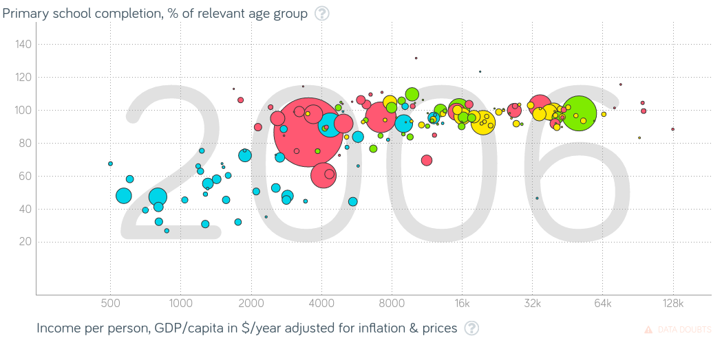
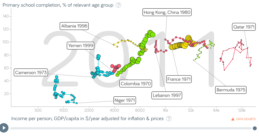
Before I could begin, I had to create graphs on the website Gapminder. One graph would have a world view using my two variables, employment rate for individuals 15 and older and life expectancy, and the next graph would only have the three countries I’ve chosen (Trinidad and Tobago, The Philippines, and The Congo). In both graphs, the x axis is the percentage of individuals 15  and older who are employed, and the y axis is the life expectancy in years. The size of the bubbles represent the population size, and so judging by the second graph (Graph 1.2), you can tell the Trinidad and Tobago has the smallest population while the Philippines has the biggest population size of all 3 countries. The color of the bubbles represent the region each country is, and so based off this information, in the second graph the Philippines are in Asia (red), the Congo is in Africa (blue), and Trinidad and Tobago is in the Americas (green). Screenshot 2016-12-20 at 10.12.06 PM.png


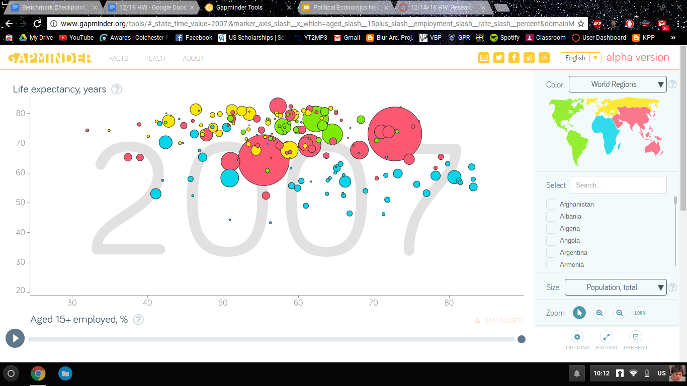
In the first graph, we can see that most countries are in the middle in terms of employment rate, and are pretty high in terms of life expectancy. There are a few African countries that are very high in terms of employment rate, even though they don’t have the highest life expectancy, and this is due to increased youth job employment in African countries and more “young people are trying to find more productive work” ("New Report Outlines Priorities To Address Africa’S Youth Employment Challenge"), although not a lot of people are living longer.Screenshot 2016-12-20 at 10.19.59 PM.png

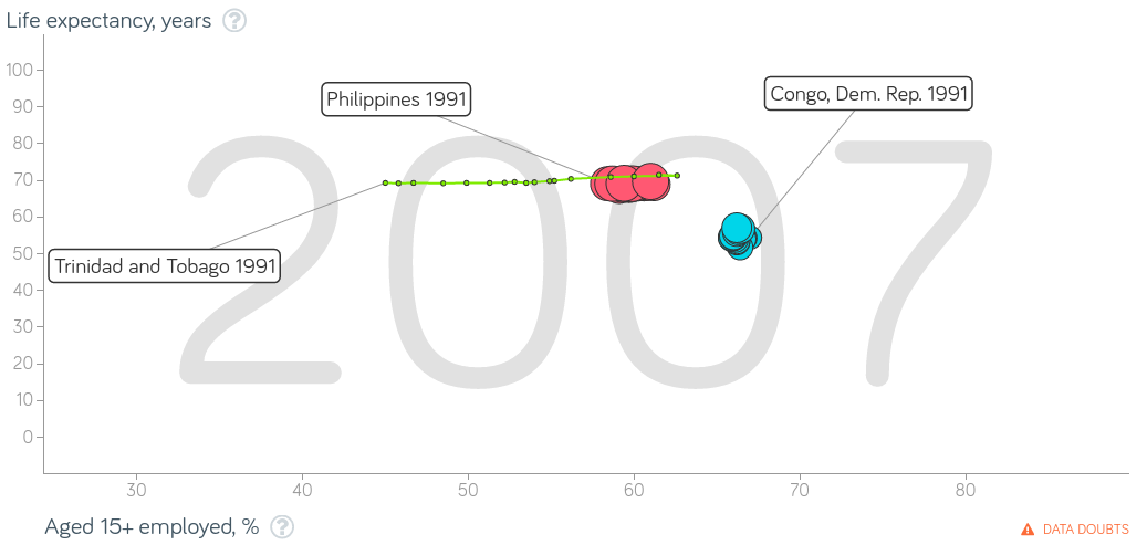
In graph two, we first analyze Trinidad and Tobago. As the percentage rate of employment in the country continuously increased (from 45% to 62.6%), the life expectancy has stayed a bit constant, raising ever so slightly at times. This means that the country has seen much more people working in recent years, but the life expectancy has barely moved from its place.

For the Philippines, the employment rate has decreased and increased multiple times during the years, making a zigzag like pattern on the graph, while the life expectancy barely moved an inch. A year where the employment rate went quite south was the year 2000, and this made me ponder why so many individuals were unemployed in 2000, and what caused the non-constant employment rate in the country. One reason for the fluctuating employment rate during the 90’s was due to the Philippines 2000 economic reform, implemented by then President Fidel Ramos, with the goal of the dismantling of cartels and monopolies, opening up of domestic industries to foreign competition, lowering of tariff barriers to stimulate competition and reduce incentives to smuggling, and de-regulation of certain graft-prone sectors. Although met with opposition from the business interests and government personalities, this could be a key reason on why the employment rate for the Philippines was everywhere.

In terms of the year 2000, which saw a steep decline in the employment rate, this was due to the trial of President Joseph Estrada, who was “charged with plundering more than $80m from state funds while in office (Philippines Profile- Timeline)”. This year is when most Filipinos struggled with poverty, rebellion from Muslim groups, “and lawlessness amid accusations of corruption, cronyism, and economic failure.” The unemployment rate at this time was also high, “and economic growth, at one of the lowest rates in the region, was insufficient to raise the rapidly increasing population from poverty (Bradsher)” and due to the ongrowing economic problems, a stock market scandal, and guerrilla challenges, foreign investment was discouraged, and it was needed to help the economy grow. However, the employment has slowly been rising over the past few years, which is a good sign, but this helps prove the point that life expectancy does not correlate with the employment rate.

In the Democratic Republic of the Congo, there was a steep drop in 1996 in terms of life expectancy, and it continuously dropped and increased. Even with the drops, the employment rate wasn’t affected as I thought it would, which brings me to the question on what happened in 1996 that cause a sudden drop in life expectancy and why didn’t it affect the employment rate that much (it moved about .1 percent). The reason for this was due to the first and second Congo wars. It became with a genocide, where “Hutu-power groups (called the Interahamwe and the Impuzamugambi) led mass killings of Tutsis and pro-peace Hutus, murdering 800,000 people in approximately 100 days (Zapata)”.  Due to the murdering of so many people, about 2 million refugees poured into the Congo from the western border of Rwanda, mostly Hutu, and “They terrorized and robbed the local population with impunity until October 1996, when eastern Congolese Banyamulenge (Tutsi) led an uprising to force the Rwandans out of the Congo, sparking the First Congo War.” Since there were 2 wars (1996-2003), this could be the strongest reason on why the life expectancy in the country fluctuated as much as it did.

Based on my research and what I know about the correlation between employment rate and life expectancy, individuals could survive in countries without a job (it doesn’t affect how long they can live),  and although employment rate could be higher than expected, that doesn’t mean that everyone is prospering and living longer in that country. And it proven in countries that reside in Africa, and my personal three countries.


Works Cited

Bradsher, Henry. "Philippines In 2000". Encyclopedia Britannica. N.p., 2000. Web. 15 Jan. 2017.

Groth, Aimee. "Being Unemployed Could Shorten Your Lifespan". Business Insider. N.p., 2017. Web. 18 Jan. 2017.

"New Report Outlines Priorities To Address Africa’S Youth Employment Challenge". World Bank. N.p., 2014. Web. 19 Jan. 2017.

"Philippines Profile - Timeline - BBC News". BBC News. N.p., 2017. Web. 15 Jan. 2017.

Zapata, Mollie. "Congo: The First And Second Wars, 1996-2003 | Enough Project". Enoughproject.org. N.p., 2017. Web. 15 Jan. 2017.


Sierra Leonean woman and Italian woman's life expectancy when living with HIV

Lucia Idriss

01/10/17

Mrs. I

Statistics


There is no correlation between HIV and life expectancy in females within the countries of Sierra Leone and Italy.HUMAN IMMUNODEFICIENCY VIRUS ( HIV) "Unlike some other viruses, the human body can’t get rid of HIV completely. So once you have HIV, you have it for life. HIV attacks the body’s immune system, specifically the CD4 cells (T cells), which help the immune system fight off infections. If left untreated, HIV reduces the number of CD4 cells (T cells) in the body, making the person more likely to get infections or infection-related cancers. Over time, HIV can destroy so many of these cells that the body can’t fight off infections and disease. HIV is an easily contracted disease that can be transmitted through breast milk, sexual activities, and also blood.Countries such as Sierra Leone are underdeveloped and do not have access to all the resources needed to sustain incurable diseases such as HIV, whereas Italy has that kind of access because they are a more developed country.  I wanted to learn more about those whom have been infected and why they’ve been infected. To truly determine what the data points on the graph represent, from the least to the greatest. So now I will test whether your location and income affect the life expectancy in women with HIV.

When I first began I asked myself questions such as : How many of these women were sexually active before marriage and where these women sexually abused to contract HIV? So I took those questions to the web to find out that, yes sexual abuse was used as a form for some of these woman to contract HIV, especially in Sierra Leone during the war time. As I searched around even further I came an article ( lifeinitaly.com ) says “ In the past sex was viewed as a taboo subject. In Italy, like so many other European countries, this was perhaps mostly due to the powerful influence of the Catholic Church on Italian society. Sex was not a topic discussed by people in public, nor did it have a presence in the media.” and “ The average age for the first sexual experience is currently 17 in Italy. This is a difference of up to four years compared to the past, in particular the 30's-40's, when women generally had sex for the first time when they were, on average, 21-22 years old. Not only has the age for first experience changed but so has the context.” So could this also be a reason as to why HIV has such a high testing rate in Italy? Yes. And that evidence can be found on the gapminder graph that I have created.

The graph on gapminder tells a story of the women in Italy and Sierra Leone living with the HIV disease. In the graph you can clearly see that there is no positive nor negative correlation between the two countries. But you can also see that Italy has a larger bubble and also a longer life expectancy than women in Sierra Leone. The bubble represents the amount of women infected by the HIV disease, but how is it that they are living longer than the women who actually have  a lower HIV infection? Poverty, many women in Sierra Leone live in poverty, they are not expected to live as long because treatment in sometimes non affordable so they wind up passing because they can no longer take care of themselves. But as for the women in Italy they are more financially equipped so they can then actually take care of themselves to live much longer. The graph’s story has been told as to what the bubbles and correlations represent.

Now I also asked myself “ does living circumstances affect treatment availability? “ and my answer to that is yes. Some people who have been diagnosed with HIV cannot afford treatment because they are too poor, but based off of the graph that seems to have not affected the life expectancy for those women whom have been diagnosed. But in recent affairs I have noticed that the graph in 1990 Italy’s life expectancy increased, and there must have been a more affordable access to the treatment. This same increase also happened in Sierra leone in 2000 and remained at that same rate in 2006 going forward. So I believe the same affect that happened in Italy also Happened in Sierra Leone.  

In conclusion, from my research I can say that HIV does affect life expectancy in Females, and I can conclude that your financial statement also plays a part in whether or not you will receive treatment for the HIV disease. But I can still remain to say that there is no correlation on the graph determining life expectancy and HIV in Sierra Leone and Italy.  


Screen Shot 2016-12-19 at 8.42.33 AM

Intro to Computer Science

Myles Nicholson Media & Design Jan. 27, 2017 Ms. Hertz

My project was Computer Science and Intro to Karel my project goals was to get to number 10 of the project but I put my mind into it and I finished the whole Karel thing. What I hoped to learned through the project was how would I be able to use Karel without any help. The steps I went to get through this project was taking my time and thinking. When I got my thoughts together and put my mind to it the project got much easier. The failure I encountered was not trying but how I overcame that was looking at my grades and asking myself is this what I really want my grades to look like, so I sat down and just started to work once I got everything down pack I started to get all the Karel programs done. What I actually learned through the project was how to use coding. What I learned about myself during the project is that I’m lazy but once I start to do my work I can finish all my work. Only way I would do this project over is I would’ve started way earlier. The tip I would give to others is just start it a lot early. This project inspired me to get on my A game and be more serious about my work.

How does the Literacy Rate Affect the Income Per Person?

The literacy rate and the income per person has a positive correlation between each other in Puerto Rico and Italy. I think that is telling us the more illiterate you are the more likely you are to have a higher income. I also believe it means that it tells you that the lower the literacy rate the lower the income per person can be. The x- axis is Income per person while the y-axis is the literacy of adults. As the graph plays the Income and literacy rate moves in an upward direction. In the first graph, the yellow represents Italy while the green represents Puerto Rico. Also if you look at the 2nd graph which has a view from all the places contrasts with the first graph with the positive correlation. I chose this topic because there are numerous amount of people in the world are illiterate.I was just wondering what type of money could they actually be making and what type of society it would be. I researched this question because I think it tells a lot about a certain place area. It tells the type of education they and the type of life they will most likely lead in the future. I chose these two places because I never really knew anything about these places except for their names. I used the graphs to compare and see if it was only with these two places or was the other places just alike. When looking at the graphs it basically tells you that the rate of you having a high income by if you were illiterate or not. The first graph only shows the two places that I chose which were Italy and Puerto Rico. In the second graph, it shows multiple places all over In both graphs you see that they both go up in a positive way if the literacy rate was high. That would also have to mean that if the literacy rate was low then it would decrease. I chose literacy rate as my topic because I wanted to know how could your life really turn out if you are illiterate.

https://www.youtube.com/watch?v=QJWOZokz57s

Women with HIV/AIDS affects on the death rate.

https://youtu.be/LJScSCyIbis

Imani Mumin

Mr. I

1/16/17

Research Paper


More than 36.6 million people in the world have been infected with HIV/AIDS and about 35 million have died from it. Many people are diagnosed with HIV/AIDS but women are drastically infected with this disease. Though over time statistics has shown that death rates due to the infection has decreased. I feel like this is an important topic to focus on because not many people in society focus on just women health. Women are all together are infected with this disease more than men. Today women are unaware of the extreme measure of this disease and I think throughout my paper they could be well informed of the this disease and how the women HIV/AIDS rate effect the death rate. Not only women but everyone should be caution of tis disease and how harmful it is.


Most people get infected with HIV/AIDS through sexually transmitted diseases but that isn’t the only way. Studies have shown that people can get infected if the virus gets inside of someone's bloods cells. You can get it through mouth, vaginal area, anus, penis or any wounds from the skin. Out of all the ways possible to get HIV/AIDS women mainly gets it from sexual intercourse. Today, of all 36.7 million people with this disease more than half are women. The website AVERT which contains global information about HIV/AIDS say that there were an estimated 380,000 new HIV infections among young women ages 15 to 49 every year. Meaning that the death rate will most likely double every year due to HIV/AIDS rates.

Screenshot 2016-12-21 at 11.43.48 AM.png


Back than death rates due to HIV/AIDS were higher than they are now all over the world. Based off of the graph I created on gapminder today the death rate of women have dropped largely because of new health resources and wealth. Once people gained the resources to be safe during sex and proper aid for sickness and any other diseases the death rate dropped. Also because countries are becoming wealthier which helps people pay for medical help to try to stay alive as long as possible. In the article HIV/AIDS by the website AVERT it says “Out of all 36.7 million people with AIDS today about 22.6 million die from it globally when before more than half died.” This information shows the dramatic change between the death rate between the times periods.


Screenshot 2016-12-21 at 11.19.18 AM.png


Women living with HIV will have the same health issues as men living with HIV but women are likely to face greater challenges. This can include trying to take care of a family, finding the best medical treatment and living with society's opinions. Although HIV/AIDS is a disease that is guaranteed to kill someone there are ways to help slow the disease's progress and prevent secondary infections and complications. In the article HIV/AIDS by the U.S. Department of Veterans Affairs it says “People who are getting treated for the disease are taking 3 or more drugs.” These drugs attacks the virus in their own ways but they prevent the virus from making copies of itself. This treatment may not cure the virus but it is a good way to help people enjoy the rest of their life knowing they can live a while longer.


In conclusion HIV/AIDS is a virus that have a large effect on women's lives but I they have a great support system and resources to health, money and education then they have better ways to prevent themselves from getting the virus. This is an important topic because people don’t really pay attention to how this disease have a greater effect on women than it does to men. Based off of the information I included we can see that overall women may have gained these resources because the death rate dropped which mean that less women are dying and becoming better with preventing themselves from getting HIV/AIDS.