Blog Feed
Q4 Art Project - The King In Yellow Falls To Feline
Let’s start with some compare and contrast…
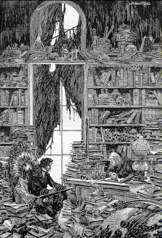
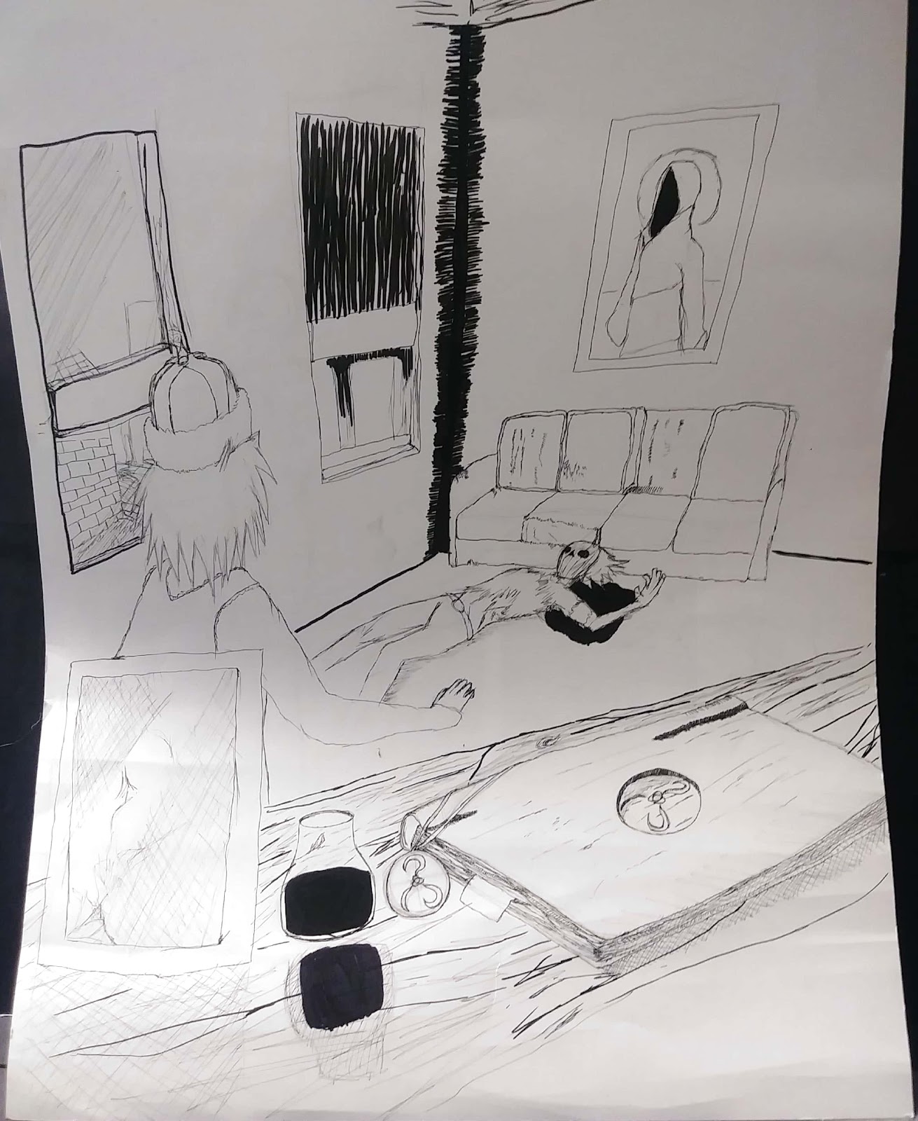
On the left is an amazing image done by Silver age Comic Artist Bernie Wrightson, an amazing piece of work done for the Frankenstein comic adaptation. Witness the detail and care put into each and every piece of clutter, see the intense planning to create a cohesive yet chaotic image. On the left is Baby’s First Cross-Hatching Tutorial (my artwork, sadly), a piece much more lacking in the planning and clutter department. The table in the foreground somewhat captures what it wanted to emulate, but not in it’s entirety.
The piece of art I created is a black and white image focused on two men standing within a room together, one on the floor bleeding and the other stunned to witness the sight. Littered among the foreground is a tome bearing the Yellow Sign, along with a pendant bearing the same sigil. Along with a framed image of an unknown woman with unknown importance. On the back wall, A hanging portrait of the King in Yellow. I wanted to truly capture the feel of a Wrightson panel. The moody darkness, and the intricate cross hatching of his panels. Unfortunately I got nowhere near that, but what can you do? I went at this trainwreck with an extra-small Faber Castel pen and a Faber Castel brush pen, along with my trusty Lead Holder (with 3h lead I got for an amazingly low price) and my extremely smaller .5mm lead pencil. I started out with a basic sketch of the scene, and I ended up having a much more solid idea of the background and foreground than the mid ground where the characters would be, and that came back to haunt me later on. I went about touching up the sketch, adding in details and redrawing the dead man’s face about 20 times before settling on a mask (slightly inspired by The Mask). After that I jumped straight into inking, starting with the foreground because that’d take the most work, golly gee, book pages and wood textures are really time consuming. After that I laid out the beginnings of the background and went about slaving over the foreground. Halfway through that I swapped back to the background and finished that, then finally, finished the foreground. There’s essentially only one technique used throughout the entire image and that’s cross-hatching, where you layer lines on top of each other to achieve a dark look, it’s not very impressive within my piece, but if you look to one of Bernie Wrightsons works you’d see it in action, depth, mood and entire silhouettes are established via cross-hatching, and the masters do it well. If there’s anything to be proud of in this work it’s the foreground, the wood texture, while a true pain to accomplish. It came out better than I’d ever hoped, and the book on said table came out spectacularly and is honestly the real star of the piece. In conclusion, I didn’t learn much, maybe something about how you spend your energy on things, or something about perspective, I’m not sure, but all in all, bless you if you enjoy the look of this dumpster-fire, and I’ll try not to make something so bad next time around.
Comparative Agriculture
https://docs.google.com/presentation/d/1x80ZdZLqJVppk1RdZ01RORsYvYz16CK7GTY0G_alC24/edit?usp=sharing
Q4 Benchmark Project - Sierra Harvey
I did a recreation of a painting by jean michel basquiat I decide to do his painting because i like like his style of art also it seem like a piece of work that would like to do in the future. I started by getting a base for my painting I wanted to do it on something that was kinda hard do it could resemble walls since he dose graffiti art. After that I painted the background red since that’s how it is in his picture Next I outlined his drawing on the card stock so I could paint it. After that I outline the lines so that it could stand out more. Lastly I painted over the whole thing in yellow so it would look like the painting. From doing this paint I learned that doing painting that don’t represent something is okay it doesn't always have to have a meaning.
While I was working on this painting some obstacles I ran into was that I had to use specific colors so that the painting would be look like the original which was hard because I had to mix color together to get the perfect color.
I am most of proud of how much my painting looks the original also the colors are the same.
Q4 Benchmark
The artist my artwork is influenced by is Picasso he has a unique technique and his artwork is very shifting. It hard to match his design and skill. He uses water colors and blends them very well. Throughout my artwork I wanted to communicate a similar but brighter picture of what Picasso made so it could bring it out more. This artwork reflects on my person experiences because I’m an extra and hype person so this is a reflection of my action and personality. The tools I used to create my artwork was water paint, water, paint brushes and a canvas broaden type paper. I used the water paint to give off a mixer of blurred colors and tone. I usec the different brushes to get into small spot, to do the bigger spots easier and to make sure my colors blended. The water gave me the necessary component to mix the colors and add an extra bright tone. The artwork I made is a picture of a girl laying on her two arms, eyes closed, head cocked to one side as she rest her background is darker but she’s brought out by bright blues, yellows, reds and whites. The background gives you a more settled darker look. With the background being black and lighten up with bright orange to outline the door and the ceilings designs. The ladies face is mashed together with multiple bright colors as well as the blue table she lays on. This artwork relates to my previous work because everything I make I make it bright so it draws your attention. It just matches with the flow and tone of the other art pieces I’ve created. The process I used to create this is first writing my own rubric on what I was doing for my benchmark and when did I want certain things completed. Then, I googled different images from my artist. Looking at his technique trying to see what I could mock I found the artwork of the girl. Next class I figured out what materials I wanted to use and started to get started with the outline. I tried first in my sketch book then on my canvas paper. Having to make it bigger so it took up a lot of the page I finally completed the sketch. Next I looked into the artist colors and saw what I had to work with. I placed the colors on my palate and started paint my sketch. Day by day I began to have it complete. Next I had to start working on the very detailed pattern in the background. Getting it most of the way I finally complete my art piece. The artist that makes similar work to mine would have to be the man who inspired me who is Pablo Picasso (https://www.pablopicasso.org/picasso-paintings.jsp). The technique that’s important to me would have to be the blending portion. Blending is a technique that takes lots of patience. A new technique I learned is how to fade. I was most proud of the girl in the painting it looked so similar to his work. If I could change something I would change the outline of the door in the background and my lining make it neater. In conclusion I learned that Picasso is an amazing artist with a lot of skill and art is all about patience.
nexus
Artist Statement
Artist statement
When looking at my work, you see a small beautiful red pumpkin that meets the eye. This is no regular pumpkin it has white dots that branch across the small pumpkin, with a bright green leaf at the stem. This specific piece shows my hard work and the beauty of it. How something ordinary can change and become more beautiful. To make this wonderful piece I used clay, sculpting tools, and acrylic paint. I used the clay to create the pumpkin shape, by rolling some into a ball. After the ball, I made the stem and leaf, but to get the detail that I wanted I had to use the sculpting tools. They helped create the lines that I needed to separate the clay and create humps. Lastly, with the paint, I used red, white, and green. When creating my work I rolled the clay into a ball. Then I put clay around a wire so that I can hold the shape of it leaning. I let it dry so that it can stay together, then decided to add a leaf. Finally, I began to paint, I started with white as the base coat then added the red so it can be more vibrant. I then added the white dots all around the pumpkin and finally painted the leaf green with some white to make it pop.
To create this artwork I was inspired by an artist that I studied in my previous project. I studied Yayoi Kusama a Japanese artist that loves dots. When looking at her work I gravitated towards the pumpkins more and decided to re-create and add my own twist to her original design. When doing this project I had a lot of trial and error but,I realized that you need patience, also a good structure. With having a good foundation for your work it will help everything go more smoothly. As I continued to work on this piece I learned a new technique that helps me the rest of the way. It was having the newspaper to help create texture and take away excess clay. As t neared the end I grew proud of my unplanned leaf and how it pulled the pumpkin together. For this project, I don’t think that I would want to change anything. I liked the way that my idea came together in the end. I learned that I liked adding my style to a previously own idea by a famous artist. With me adding my style to the original and seeing the difference showed me what I can achieve.
Q4 Benchmark - Cindy Perez-Nieto
This quarter I enjoyed working on the project because I have felt stressed about the quarter since it started. I really wanted to work on something that wouldn’t stress me out because I was learning how to use the new materials or how to draw something complicated. I chose to work on something that relaxed me and helped me think as I was drawing and coloring.
My project for this quarter was to draw a tree with the four different seasons. It was supposed to show how the tree changing throughout the year correlates with how we also change. We change a lot as the years go by and when we think we already know enough about life, we don’t. Trees change also as the year goes by but they are still the same them. We are still the same but with knowledge and wisdom.
I most proud of taking my time and being very organized with this project. I was in charge of making my own time and schedule to turning in my checkpoints. I think this was a really good way in learning how to be organized without having the teacher be on your back about the assignments. It was a way to give us a little taste on how college life might be.
In conclusion, this project went really well and I am glad I got to work on something that relaxed me throughout this entire quarter. A lot of people helped me out with my project too by giving me insights on how to make it better. I was able to do a even better job on it.
Q4 Art Project
My project shows two men relaxing and conversing by a tree these men our abstract characters and have strange bodies. I want this to show how us people are peaceful, loving and kind creatures. It also shows how we relax and chill. For this artwork, I used colored pencils and a pencil. I used these because they were the best option to make light and dark shades for my drawings. This relates to my previous work by how I was using different shades of color however, I used multiple instead of just black. To create my artwork, I first started to replicate the image by sketching it. As I did more, I shaded it darker until I was able to color. Then I outlined it in color pencil by pressing hard after I just colored it in. Melike Kara made this work and this inspired me because of the Abstract art. The technique, sketching is important because if you make a mistake it’s easy to erase and makes the process better. I am most proud of how good I replicated this work because of the sheer difficulty the style of drawing was. However, that’s what I wanted. I wish I could change how long the arm was and the eraser spots on the project because it makes it look like a mess. I learned a lot about my artist Melike Kara and how her artwork is amazing however, the artwork is strange and hard to read. However, that’s what I like about her work.
Quarter 4 Final Art Benchmark
For my quarter 4 final project for art class, I decided to create a self portrait of myself. I choose a self portrait because the artist I researched (Frida Kahlo) was known for her phenomenal portraits of herself. To create my work, I used plain thin white colored paper about 12x13in wide. I wanted a natural soft appearance of the portrait so I used light pencil to sketch it out and colored pencils only to fill it in. This relates a lot to my other work being a lot similar because my motive is to always keep it simple which means my supplies are similar to my other projects supplies, processes as well. Creating my project, I set up checkpoint for myself so I could receive the best product possible. I created a rough draft, fixed up my flaws, started my final and began adding final touches and color. I received a peer review as well. Frida Kahlo inspired my work for this project. It is very similar to the art she creates and to her portraits. I am most proud of my finished product of my art work and I am most proud of how I managed my time. In conclusion to my artist statement, I learned your artwork is what you make it and that you can create anything you put your mind to.
Q4 Artist Study
The creation of my artist study displays an inspired japanese bridge hovering over a pond filled with lily pads. The background of my artwork is a gradient of light colors representing foliage. When creating this artwork, I wanted to convey a sense of scenery and tranquility that I receive when I look at nature and specially ponds.
When creating this artwork, I wanted to originally use oil paints to stay true to my artist style, which was Monet. However, I ended up using watercolor for my piece. Regarding tools and materials, I used three different kinds of paint brushes, a water cup, watercolors, a watercolor palette, newspapers, frog tape, and watercolor paper. I used frog tape to tape my watercolor paper to my table so the paper doesn’t curl upwards. I feel that this work is something new and different from my last project which was my still life. I say this because my still life was only done in pencil and had no color or values as opposed to this piece which has different layers.
My first step was to do brainstorm what I actually wanted to draw. I did two outlines of my final product but both were at different angles. One being close up while the other being zoomed out and showing more of the landscape. I ended up choosing the close up perspective of the bridge. I then started to do my rough draft and figuring out different color combinations I wanted to try. This was followed by me starting my final piece. I first did a light wash of the base color and continually started to layer color on top of color to add more depth. This project was inspired by the artist Monet, specifically this artwork which can be found here.
When watercoloring I think it’s important to be patient with your work when you’re layering different colors. If you decide to add more color and the last paint didn’t dry yet, then the pigment will just go everywhere. One technique that I learned was how to ombre colors, so they look that they flow smoothly in together. As well as freely painting. When I usually paint, I get scare of overpainting and accidentally brushing a color onto something that it wasn’t supposed to go on. Overall this was a fulfilling experience that made me want to paint more in the future, I also found it relaxing and eased my mind.
Q4 Project
For my drawing I drew something that was close to home. I drew a big S which stands for my name Shaiann. Then I have logos, words, pictures, flags and other things that represents me as a person surrounding the S. I choose to draw this because I thought it would be a great representation of myself without saying or doing to much. ASAP mob is a logo I put on there because ASAP is a rap group that I really like, mostly for their style but the also make great music too. I put a Trinidadian flag on the S as well because I’m Trinidadian and I love my culture so much from the foods, to the music is just amazing. I also have sayings logos that represent my favorite rappers because they have a big influence on me not just there music but the morals that they carry. I drew it with pencil then went and colored it in with color pencils, just because it was easier and I didnt want to ruin the picture with paint. For my slideshow we did previously I researched Jean Michel Basquiat, because I really liked his artwork, and his story to fame. So I decided to get inspiration from him and apply it to my artwork. So that's where the bold colors came from, the cludring of pictures, all drew inspiration from his artwork.
Q4 Project
For my quarter 4 project, I decided to create a sculpture inspired by Yayoi Kusama’s piece called “All the Eternal Love I Have for the Pumpkins”. In my project, I shaped my pumpkins using clay, and after they dried, I painted them with yellow paint and began to splatter black paint on them. To create this, I began to use balls of aluminum foil, that I then covered in clay. To sculpt the clay, I used clay sculpting tools, and let dry. After the clay dried, I used acrylic paint brushes to paint, and another paint brush to splatter my black paint. A new technique I learned while creating this project, was to use aluminum foil to create the balls and not use an unnecessary amount of clay that I found worked really well. One thing that I would change about the project is I would try to give the pumpkins a better shape and work more on the actual sculpting of the pumpkin. A relation I found between this and my previous artwork was the color that I included. Both of my pieces used very bright colors on them.
Q4 Final Art Project
Q4 Project
I created a sculpture of a woman pouring paint. It is a black and white woman and the only color is from the color she is pouring on the floor. I wanted to recreate a famous photo of the well-known sculptor Lynda Benglis. To create my sculpture, I used tinfoil, clay, acrylic paint, wood, hot glue and various clay tools. I first used the tinfoil to create a basic shape to mold the clay around. After I was able to mold my clay around the Torso I had created out of tinfoil, I then let it air-dry. I painted the platform and the clay woman in white and black paint and let it dry. Then I took plastic wrap and poured red blue and yellow paints on to it and then proceeded to swirl it around to create a pattern. This gave the illusion of poured wax on a floor. Once everything dried I made a bucket out of clay glued the acrylic paint onto the bucket and then glued figure onto the white platform. My current work is very similar to my previous work because I created a clay sculpture in my last project too. A new technique that made my sculpture easier to create, was the tin foil method. By balling up tin foil, it made my project lighter and it caused the clay to crack a little less when dried. I am proud of this overall project because I believe it looks very nice, and it stays true to the original idea I had about it.
Q4 artist statement
My artwork is a replication of one of David Choe's painting, "David Choe Pyeong Chang Olympics Watercolors." David Choe is best known for painting murals, and graphic novels. My artwork is a figure skater. My current work relates to my previous work because I have done shade and texture in art before. Instead of watercolor, I did texture drawing. The materials I used when making this art was a 2H, 4H, and 4B pencils. I first drew a figure skater with a 2H pencil. Then, I used a 4B pencil to outline the shape of my drawing. After outlining the shape of my drawing, I used a 4H and 4B pencil to shade my drawing. I used a 4H pencil to lighten the parts that I wanted. I used the 4B pencil to darken the parts that I wanted. After shading my drawing I decided to use watercolor and paint the outline of my drawing to make it pop. The colors I used were white, flesh tint and magenta. A technique I experimented more with the process of making this work is shade and texture. I'm most proud of the way my artwork turned out. In conclusion, something I learned through the completion of this project is to use your time wisely.
Drawing with Pencils
My artwork consists on the main character of a pretty famous manga and anime called Tokyo Ghoul. In my art I drew the main character, Ken Kaneki, with his mask in ghoul form. His mask covers all of his mouth and half of his face (downwards). It has an eyepatch that is also attached to the mask and covers his right eye, which is the eye he can’t turn into ghoul form. My second artwork is Kaneki’s best friend, Hide. He has very punked up hair, always seems happy and is also smiling, unlike his friend Kaneki, which is in the drawing, saddened. Lastly, my last drawing is based on Kaneki’s crush, Touka. She is a girl that wears a bunny mask and is a ghoul, unlike Kaneki, who is part human. The reason why I choose this trio of characters is because each one of them is equally important. Hide, Kaneki's friend, as a character, plays off the remaining human aspect of Kaneki while Touka plays the ghoul side. That is the basis of my artwork. In my artwork I just wanted to reflect how much time and dedication I gave towards Kaneki. He is a combination of two worlds and is a very conflicted person. Besides being a ghoul and being conflicted, in a way, I can kinda feel related towards the character as I am come from a different place than where I am from right now. Also I understand concepts that other people cant due to me having experiences from two perspectives, the hispanic side and american side. Due to these reasons, coupled with the fact that the artist I choose to do my artist study, Mark Crilley, also did the same drawing some time ago.This gave me the motivation to do this project based on the series and the style in which it was done. The only tools I used when drawing the whole thing were a point 2 pencil and eraser, no other special tool. As for this artwork, I kinda find it standing out from the rest as it is very different from my past work. This one involved me more time as well as effort, while my usual drawing and work don’t.
When I started creating the work, the thoughts that mostly came up in my mind where two, where does everything belong, and where is the light hitting the character from. This and some images of the characters allowed me to draw the project. When I needed to add more darkness to a certain spot, I just cutted a piece of led from my pencil and with a fresh side, I would add more detail to the drawing. As mentioned before, the artist that inspired me to do this work was Mark Crilley, the reason being was because I loved the styles of art he made due to them being similar to mines, and the fact that he drew the same character a long time ago. This made me even more motivated to draw, and made me do the work in a more dedicated manner. A technique I used a lot in this type of drawing was to always look ahead of the drawing, kinda like foreseeing the future. The reason for this was because I was working a lot with lighting and if I were to redo something then it needed to be before I drew it, since if I did it after, then I would have the eraser marks in the final drawing, which would look awful. So planning ahead was a very helpful technique I used. I am most proud of this work due to the fact that I was able to do such a high detailed drawing with lots success. All that I got was positive feedback and it made me very happy to finish the drawing the way I did. If I could change one thing about the drawing, then it would be to change the neck size, since in the final drawing it was a little too big. In conclusion I can say that the making of these drawings were very helpful to me and made me notice that I could accomplish very complicated things, as well as be able to do it on my own.
Jim Lee Batman re-Work
For my project I chose to study Jim Lee, a Korean American comic book artist. By looking at Jims artwork, I had to create an art piece that was some what similar to his art kind of resembling it j or creating my own art, In the end I decided to do some similar to his. I drew one of the most well known Dc Characters Batman some one who Jims come to love in character/drawing terms. Jim is really good at shading which is what I attempted to do. At first batmans face wasn't as long and chiseled. It was short and stubby. I ended up fixing it and it looks so much better. In the end I decided to give Batman blue eyes something he gained in the Arkham Knight serious called Detective mode. I decided to do something that corresponds with Dc characters because I really enjoy their work I thoroughly love it through and through. For my artwork I used a pencil, shading pencil, and color pencil, and eraser. I outlined Bruce's face with a Pencil. After that I added the lines creating a more chiseled face. After that I got the shading pencil and started filling up the face in places that looked to shiny or exposed. After that I a took my color pencils (black) and went around the page shading it, then erased the really dark spots. I freaking loved the outcome Compared to my other piece done earlier for this class I think its way better than the last piece. In conclusion thanks Jim for being able to help me improve in art similar to yours. A little bit of influence can go a long way and bring out the true artist in you I really love this piece deeming it my favorite out of all.
Jake Gyllenhall and Heath Ledger
The piece I created is a greyish white mountain that covers a lot of the bottom half of the page. The mountain has trees scattered throughout it. The trees are light green and light brown. There are not that many on the mountain but they are there. Then there is a darkish sky that is also light. It connects with the mountain. In the sky, there are brown birds. They are a darker color and are also scattered throughout the mountain. I want my work to communicate that this could be somewhere in the world, anywhere. Also, that nature is a valuable part of life and that life is simple and not everything is perfect but it still is something. To create this artwork I used watercolor and a variety of brushes. For the mountain, I used a pretty standard brush and mixed black and white to create my grayish color for my mountain. For my trees, I mixed a dark brown with a green to create the color for my bark. For my leaves, I just took a standard green and used a fan brush to create these evergreen-like trees. For my sky, I mixed a really dark blue with some white and painted her on. Some techniques I used were like quick side strokes for the trees. The rest was regular painting.
My current work relates to my previous work because all my work starts off with a plan and it usually does not go according to the plan because I mess up but then it turns out okay. Also, most of my work has a sky. I’m proud of my birds and the trees that I made. I would change the way the mountain curves because I do not like it.
The artist that inspired me is van-Gough because his work is a lot of scenery and trees and mountains. I think it does not really reflect his work but in my eyes it does.
Q4 Art Project
For my project I chose to study Akira Toriyama, the creator of the dragon ball series. By studying Toriyama, I had to create an art piece that either was an attempt at doing his own artwork just like him or making my own art but in his style, I chose the latter. I drew two African American warriors, powering up I guess, some distance away from a city. I meant for the picture to mirror Akira Toriyama’s characters of gohan and piccolo, well their relationship. My taller and more muscular character was supposed to be my smaller characters teacher and mentor, like piccolo is to gohan. By the taller character being older, I decided to give him grey hair as well. I wanted to depict my characters as African Americans because they’re are very few in dragon ball. This also connects with me because I am African American and I really see my race and culture in the anime style. In my artwork I used a pencil, micron pen and crayons, nothing out of the ordinary. I drew my characters and city background with pencil first and then went over them with micron pen. I waited for it to dry a bit and then I erased it, so only the micron pen was left. I then colored my characters and the city landscape. I wasn’t to happy with the coloring but aye it can’t be perfect. Compared to my other work done for this class I think its relatively around the same level. I’m still not really impressed with my artwork for this class. My art outside of class is a lot better in my opinion. I also used the same old, usual materials. I think studying the anatomy of Akira toriyama’s characters and their eye placement is really important. I’m proud of the fact that I got the eyes right. So in conclusion, I wasn’t very proud but it overall I guess I am satisfied.
Q4 Art Project
My art is a split between my artist and his work and me with my mindset and my work. The background for both me and my artist are different and the things in the background are different on both sides. I wanted my work to communicate that the artist that I compared my style to is similar to my work and we live in the same world but our mind drift in different ways and how my universe, imagination runs just as wild but in a different way. The tools that I used to display my visual is watercolors, watercolor paper, watercolor brush, micron pen, and a pencil. My previous work is similar because it my last work Ii compared my different works in different worlds and backgrounds with my imagination. The process of creating this imagine was simply but time consuming because at first I thought of my idea but trying to display it was hard. I first started my sketch and then when over with the watercolor paint, then I went over for the details with the micropen. The artist that is similar and inspired my work is Salvador Dali and I put him in my artwork to compare both of our work. I am most proud of how my idea kinda came to life with the pain even though it wasn’t 100% how I wanted it. If I could change one thing about this painting I would change how I used the watercolor in some spots near the face. In conclusion in this project showed me how to use the watercolor and what I could do differently with how I create my ideas.
Q4 Artist Statement
For this project, I created a colorful butterfly surrounded by different designs. The background of this painting consist of many designs such as circles, stripes, and zig zags. The same colors used for the background design was used for the inside of the butterfly. Through this work I want to communicate that the viewer has to look deeper behind the background to see the beautiful butterfly. For this project I used paint brushes, acrylic paint, paper, and a pencil to create this artwork. Before painting, I made a detailed sketch of the outline of my painting. My current work relates to my previous work because of the acrylic painting and paper that was used. This painting didn’t take as long to create because of the simple colors that were used. I use green, red, yellow, and purple paint. I used painting the background of the butterfly first. Once down the background, I began painting the inside of the butterfly with little light paint strokes. An artist who makes similar work who inspired me was Damien Hirst. Damien Hirst was inspired by John Noakes to try spin art. Damien has stated the inspiration for his famous spin paintings were also from a children’s TV show called Blue Peter. This TV show demonstrated this technique in 1975.
A certain technique that was important during this artwork was not to use too much water when painting. Something I am most proud of in this work is the neatness when painting the background. If I was able to change one thing about my project, I would change the color choices. I only used about four colors. I wish I bended more colors which would of made my painting look more attractive to the eye. Overall, I enjoyed creating this artwork and learning more about different artist.Dora Budor's Inspiration
This quarter I did a drawing inspired by the artist I studied during quarter 3. Most of the sculpture or photographs she took were inspired by natural disasters, for example the movie twister. My drawing is of a camera recording a wild fire in the forest. The work i drew doesn’t communicate with my culture or my personal experiences. We don’t live anywhere where wildfires occur or any other type of natural disasters. Yes fires do happen but not in a very overly dangerous way where it would burn down half our city.
For the tools I used for my drawing, i used pencil, coloring pencils, markers, and oil pastels. It was a very simple process for drawing this piece. I think this piece is very different from all my other pieces, they were things that I was into or they were drawing that symbolizes my childhood experiences. The artist that inspired this work was Dora Budor, she didn't do any certain techniques that made her work stand out, I just think her work itself was different from other famous artist. A new technique that starts using was how I colored with pastel charcoal crayon, I use my fingers to spread the color around. Im most proud that I came up with the idea that I should color the camera, I made my drawing look a lot better. I think I’d I could change one thing is that I would’ve pushed myself to draw something more detailed.
Q4 Artist Statement
While I was studying Claude Monet, I hypothesized how I would be able to put his imagery and his perspective on his life and implement it into my own project. From the different time periods, it was incredibly difficult to understand his perspective in painting. However, I found a painting from Claude Monet that resembled a dock and a flag in the background. I decided to use the same scenery and implement it into my own project. I took note of Claude Monet’s method of painting the sky. I found the sky to be very interesting because it was incredibly bright and lush in colors. I also noticed that Claude Monet liked to use high contrasts when painting in order to make objects stand out even more in the painting. After learning all of these core concepts that Claude Monet used in his paintings, I understood that he was focusing more on smaller details which eventually added up to the bigger image, the painting.
During this project, I used an assortment of colors. However, I tended to use an ultramarine blue-like color. I continued to use the technique of providing “x” strokes on the canvas for the sky, however, made the “x” strokes stretch to provide more depth in the sky and ocean. Originally, I wanted to make the painting somewhat a night scenery but found it difficult to implement as the contrast would be virtually nonexistent and ruin the objects in the painting. I improvised the sky and ocean by mixing green, blue, and red, consistently. I can not remember the colors because I had used a wide variety in order to accomplish the lush sky and ocean. Overall, I found the sky and ocean to be the most enjoyable experience when producing the painting. I was able to implement some of Claude Monet’s concept and theory in painting which made the painting a lot different in comparison to other painting projects.
In the painting, there is a flag, umbrella, boardwalk, ocean, and sky. I made the flag stand out from the sky and the ocean which gave the painting contrast in general. I made the flagpole black with some white marks to provide the reflection off of the sun. Along with this, I made the physical flag green to contrast from the blue ocean and sky. The boardwalk was coated with umber paint and I eventually mixed the umber brown with white in order to provide a creamy peanut-like color which symbolizes the reflection off of the sun. I used the same concept on the fences on the boardwalk, however, I feel as if I used too much of the white color. I also did not paint the umbrella properly because I had a hard time implementing the reflection off of it. Instead, I tried using an ample of colors in order to make the umbrella look lush in colors. This turned out fairly moderate to my expectations. I intended to make the umbrella a red-pink color in order to contrast itself from the brown boardwalk and blue sky and ocean.
Overall I found the project to be very enjoyable. I was able to mimic Claude Monet’s concepts of painting which I believe, gave me a stronger understanding of shadows and lighting. I found the concepts to be very educational and I motivating even after if objects or key features in the painting do not go correctly in the right way. At first, I was having a hard time trying to implement the ocean and sky without making it too dark (which happened) and I was able to fix the issue by providing brighter and vibrant colors in the mix which overall fixed the problem. Using acrylic paint made me understand the concepts of lighting and contrast, which overall, made me feel as if I improved as an artist.